Foxtel Go 2.0
Foxtel Go is the IPTV solution of FOXTEL, which allows customers to stream content on their mobile and desktop devices. In 2012 the v1.0 of the product was released. By the start of 2015, the app was suffering from performance, stability, and usability issues.
I led the product design – user experience (UX) and user interface (UI) of Foxtel Go 2.0 in 2015-2016
Summary
I was in charge of the redesign of Foxtel Go, working in collaboration of 2 business analysts, 1 product manager, 1 tech lead, and multiple stakeholders across the organization. I was responsible for the design thinking process, from discovery, ideation, design, testing to delivery. I analyzed current user research studies, ran several design workshops, performed usability testing, designed the user interface, and delivered detailed designs to the developers. After 1 year of efforts and countless conversations, the designs were successfully delivered and built. Today, in 2019, the core structure of the work done remains live and functional to Foxtel Go users.
Discovery
Understanding users
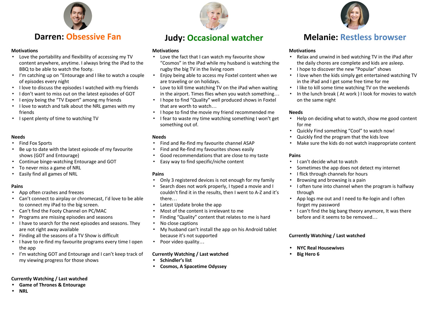
For the purpose of improving the user experience of Foxtel Go, it was vital to gain a better understanding of Go's users. Therefore, I analyzed and synthesized data from 4 different research sources. This allowed me to develop personas to help the team visualize and socialize the user's needs, pain points and motivations.
Research sources: Foxtel GO April 2014 Update, Foxtel GO Usability Testing Research – July 2014, Foxtel Go Usage Reports – Aug 2015, Apple Store + Google Play Reviews Aug 2015.
Defining the main areas for improvement
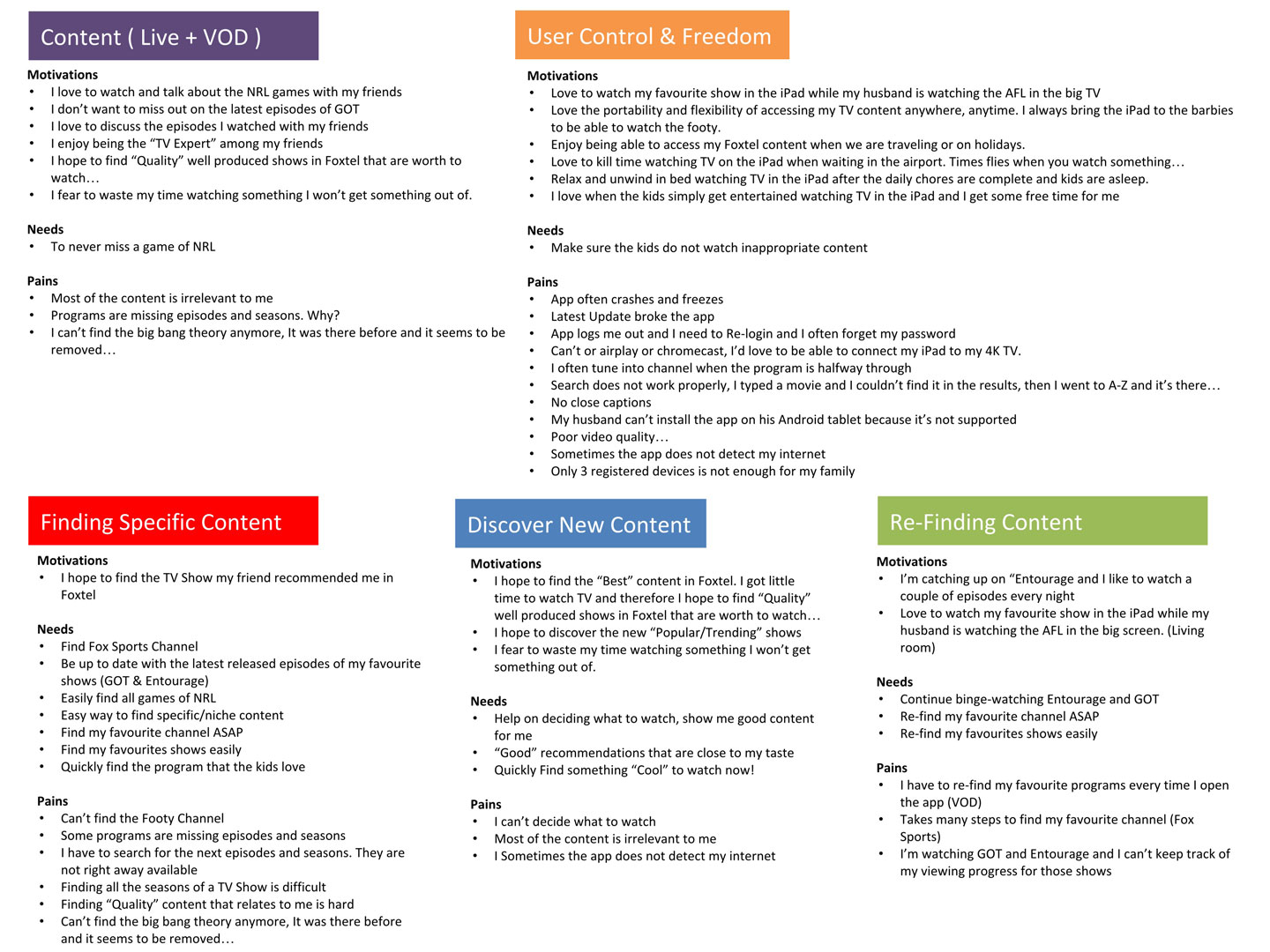
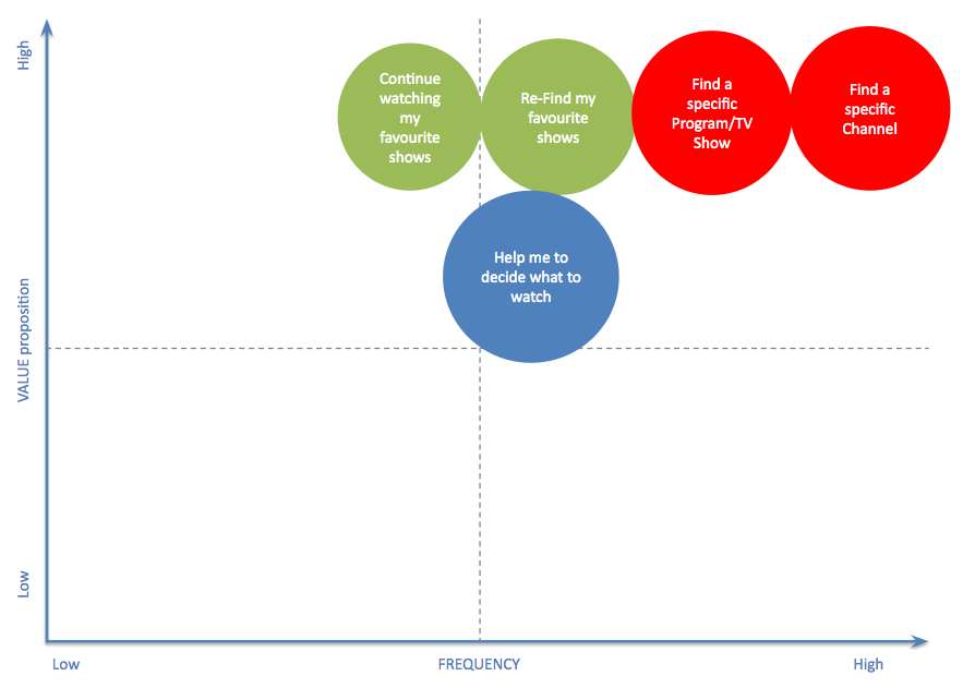
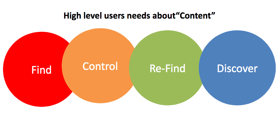
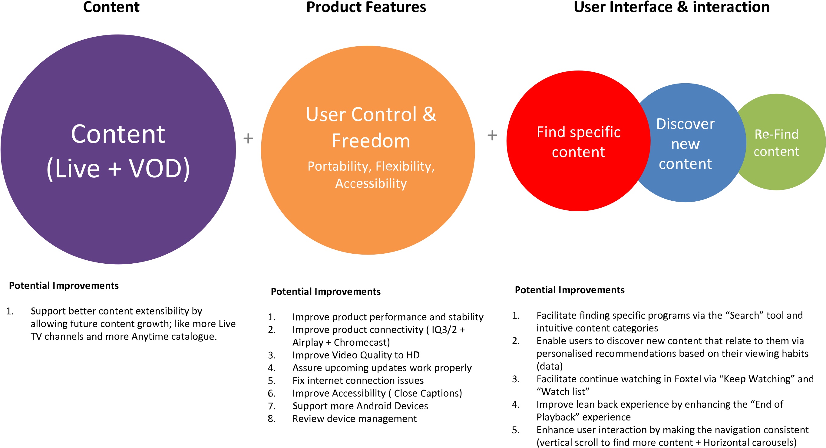
Clustering user's needs, pain points and motivations into categories to help the team visualize the areas where we need to invest our efforts
Ideation
Improving Content Discovery
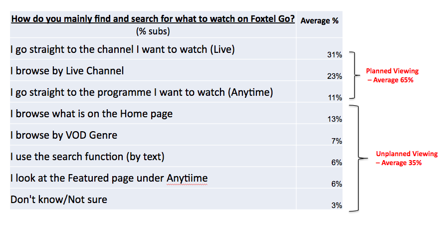
How do users find content? After analyzing the user's search behavior, I found that when looking for content, users first browsed from page to page and tap here and there to see if the content presented at first sight satisfied their needs. Otherwise, users opted to use the “Search” tool and enter a query that relates to the content they are looking for.
Browsing
- User Scenario: As a user, I would like to find content “relevant” to me in the app, so I can start watching something I may like.
- Problem: When users browsed for content, often they couldn’t find anything relevant to them. For this reason, it was critical to introduce a new feature that allows the platform to display content relevant to each user.
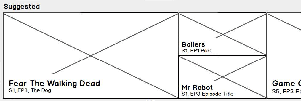
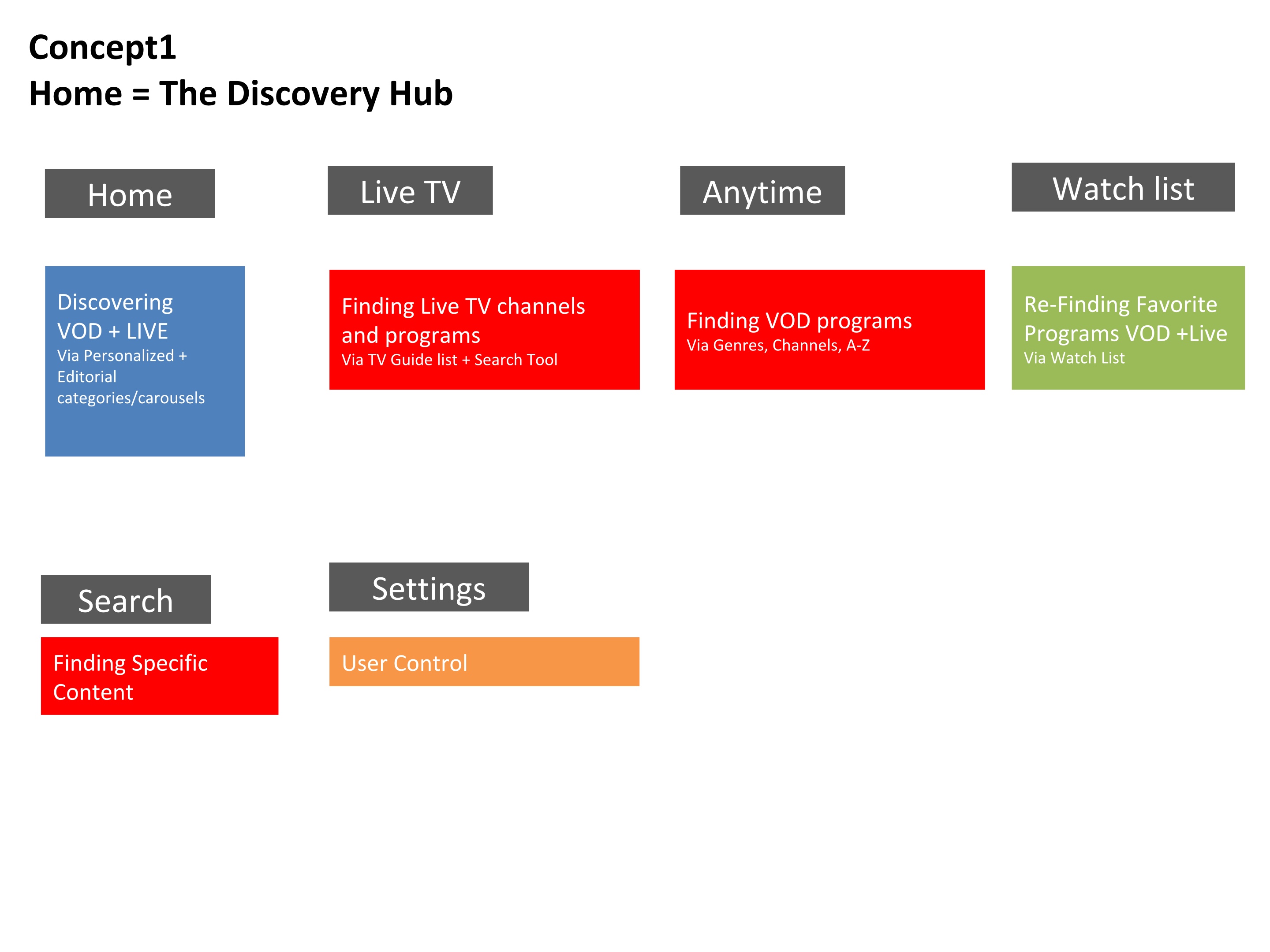
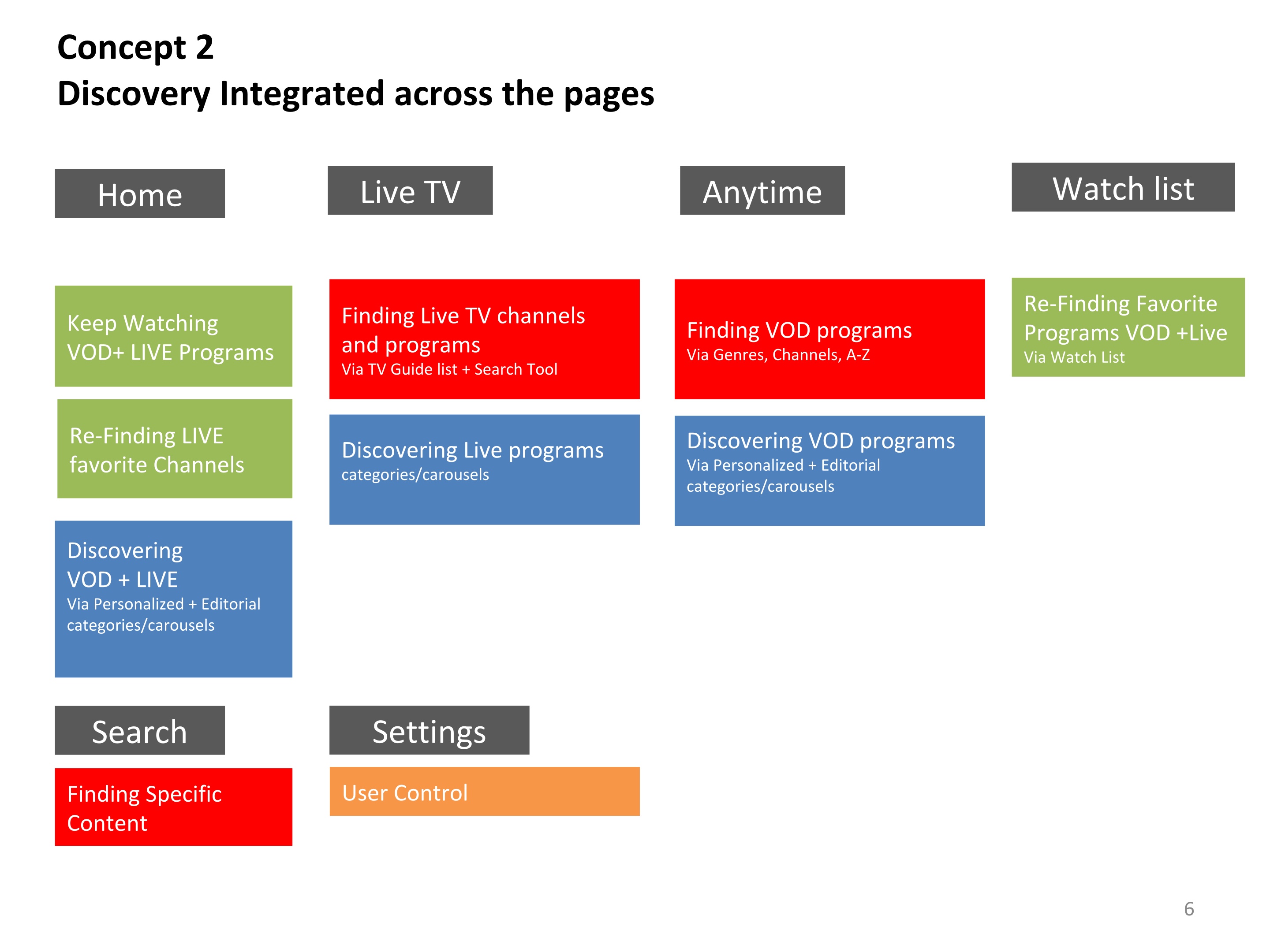
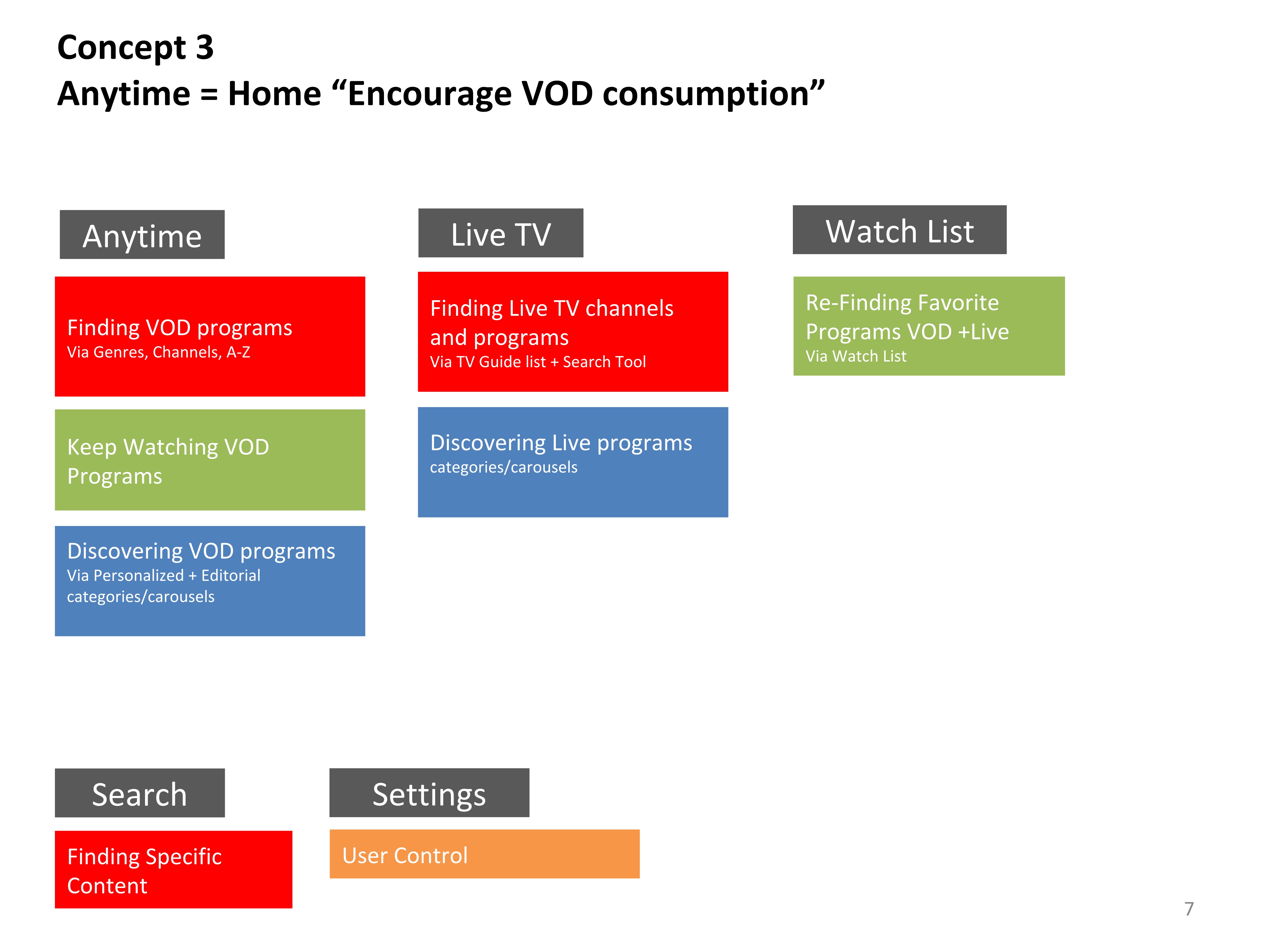
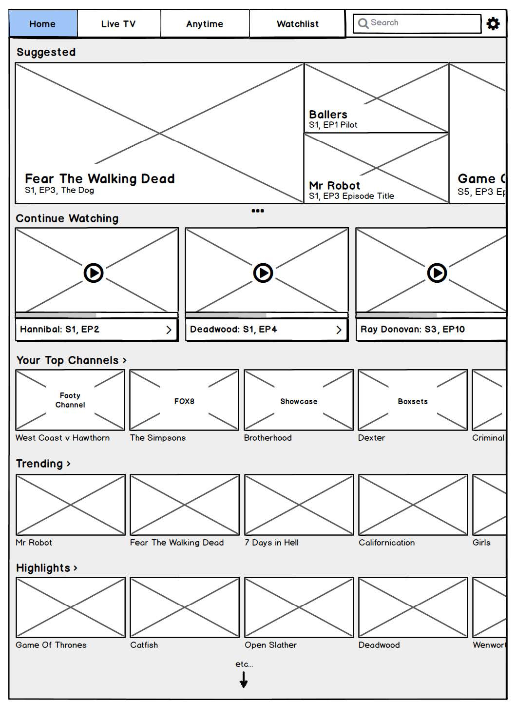
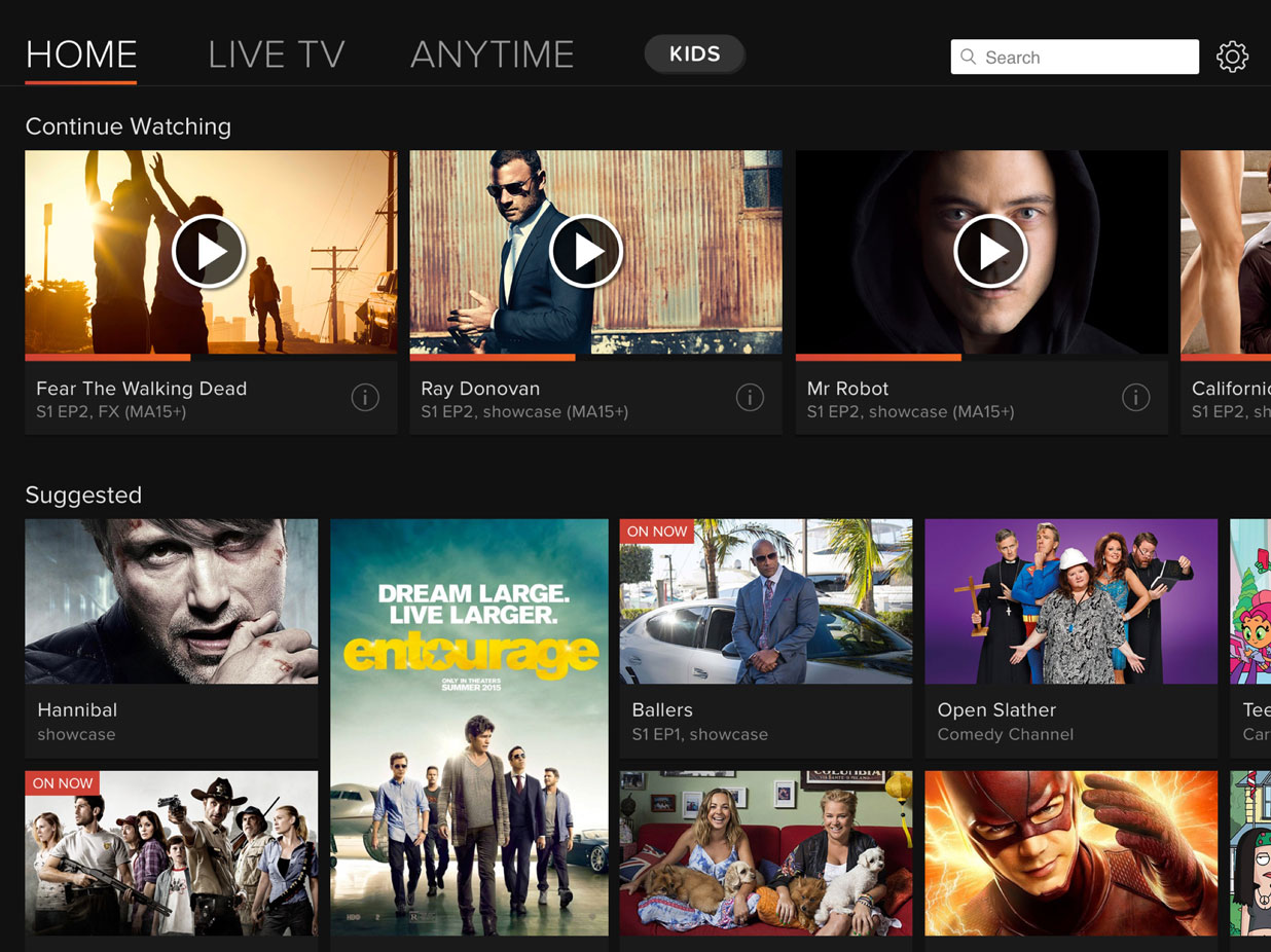
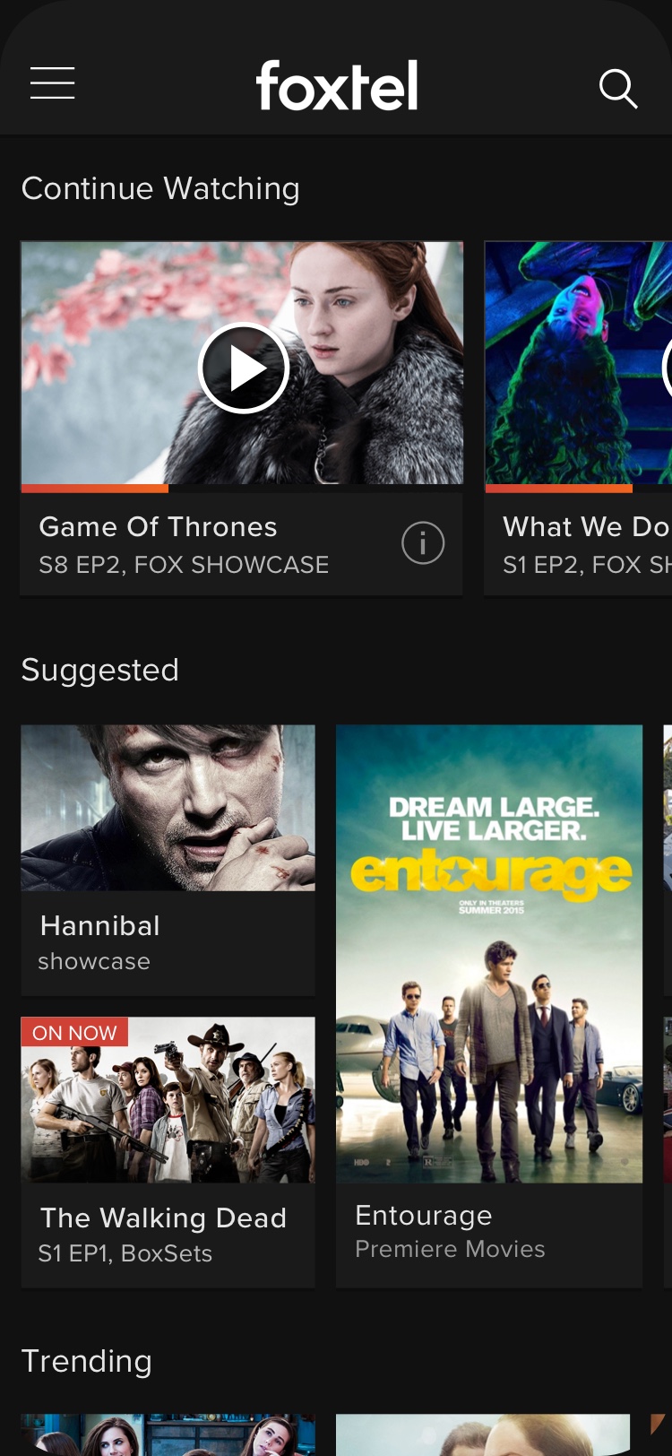
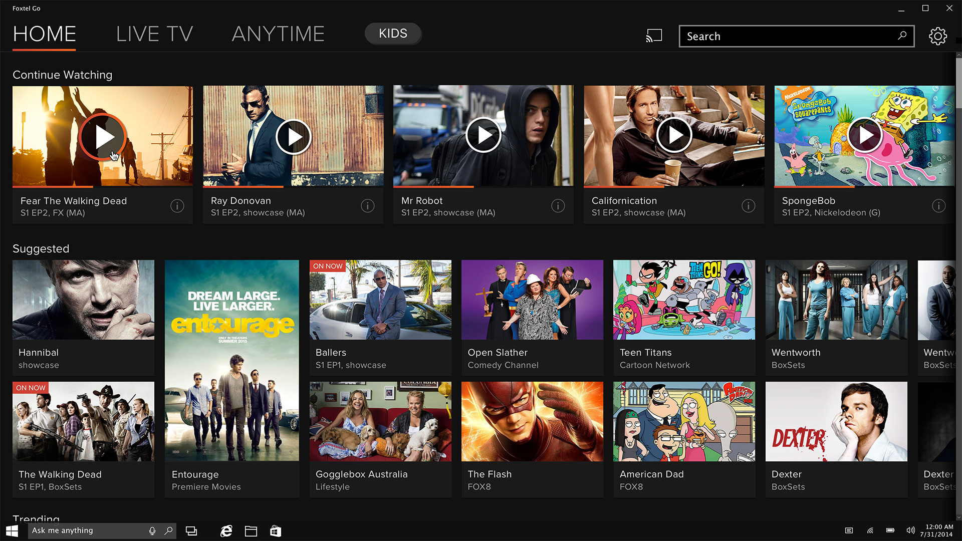
- Solution: Add personalized (Suggested) content recommendations based on the user’s usage data. Similarly to what Netflix was doing at the time. Our hypothesis was that this would help users to find “relevant” content faster.
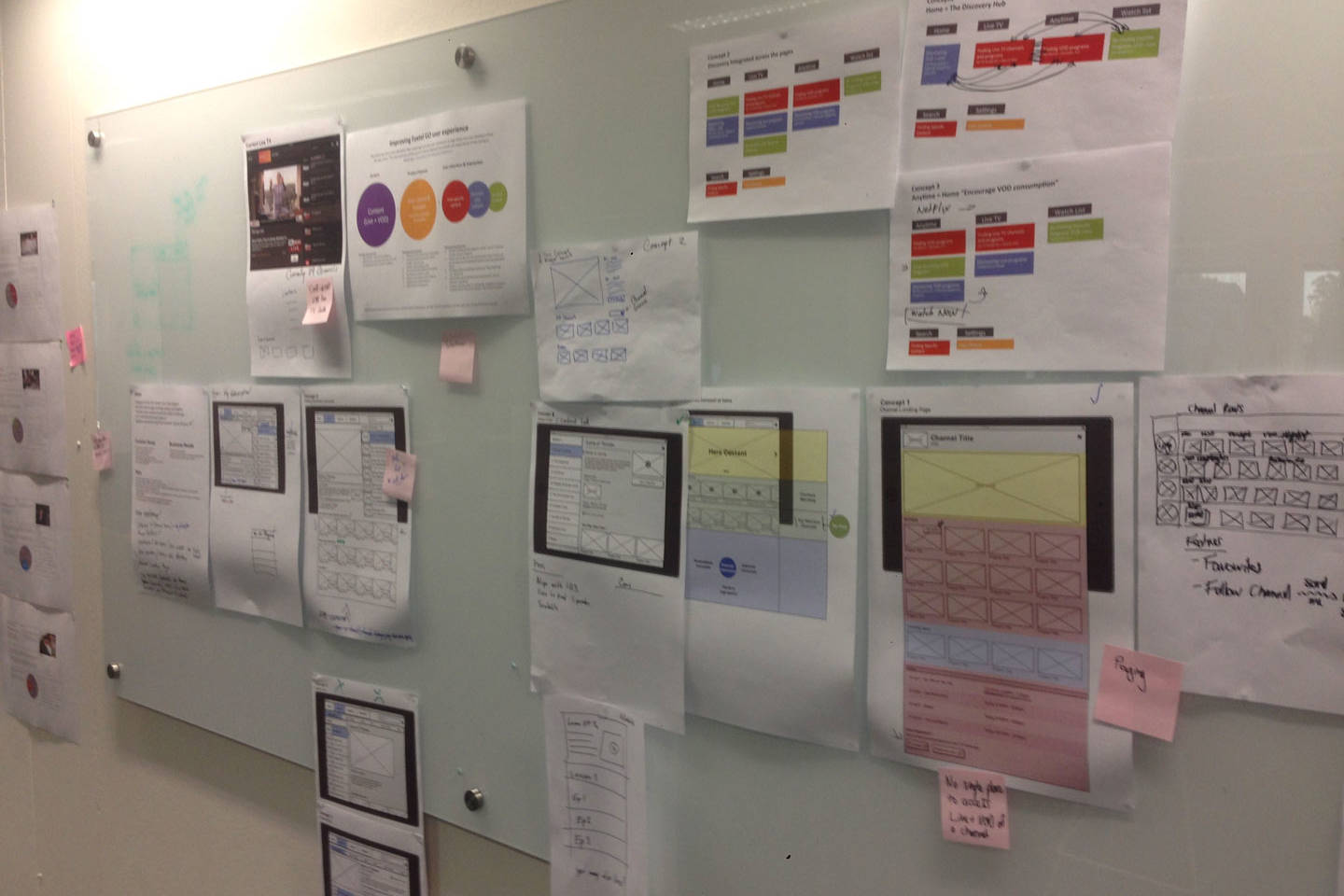
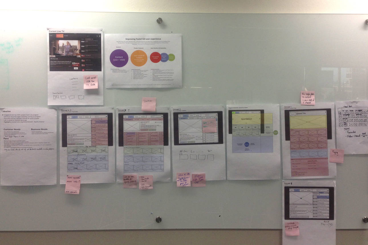
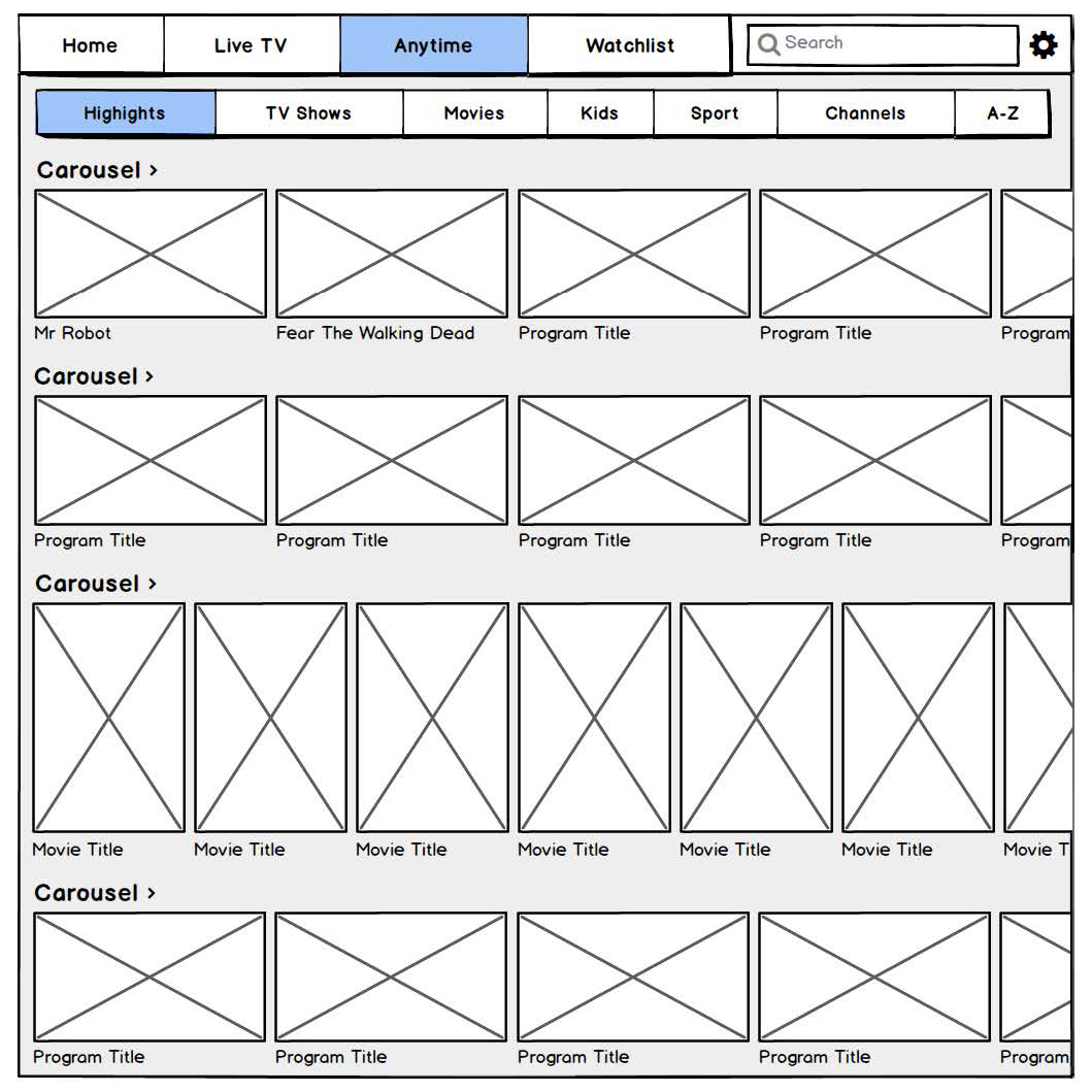
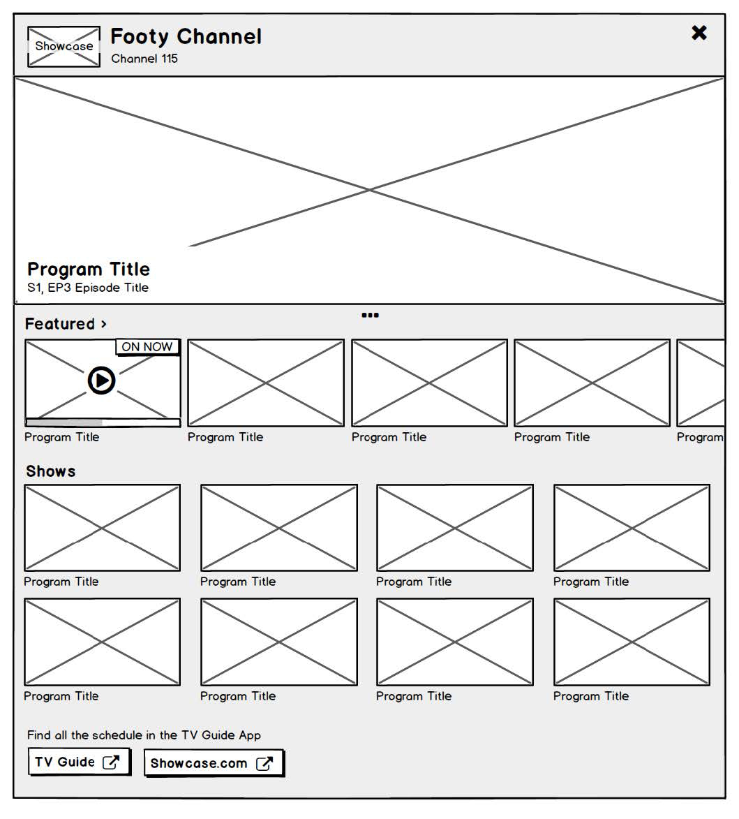
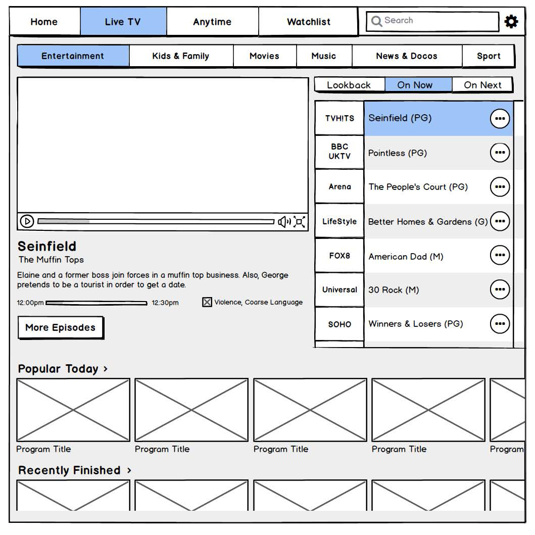
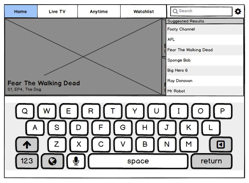
The schemas below, display how this could be integrated across the application. I ran several design workshops with the product team in order to generate these concepts:
- User Scenario: As a user, I would like to re-find content that I have been watching so I can continue watching.
- Problem: The application did not offer any ways to re-find content.
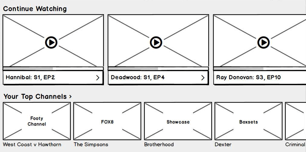
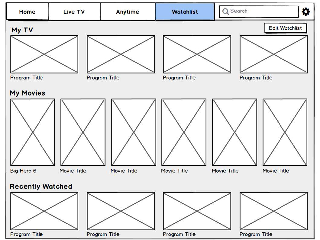
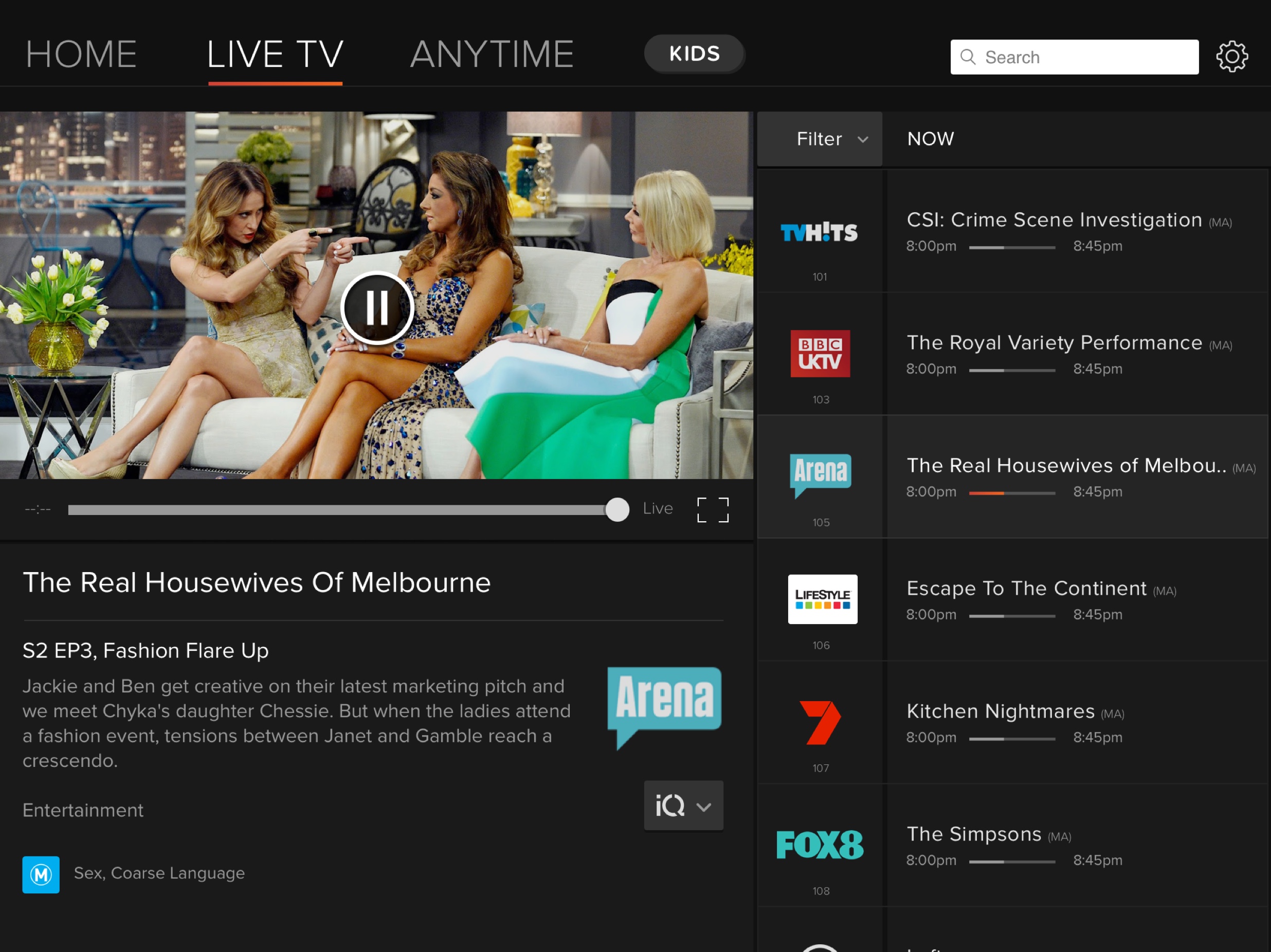
- Solution: For “VOD”, adding a “Continue Watching” row to home to allow users to re-find the last program they were watching. For “Live TV”, adding a row with the user’s “Top Channels”, will also facilitate the re-finding of a live channel.
Searching
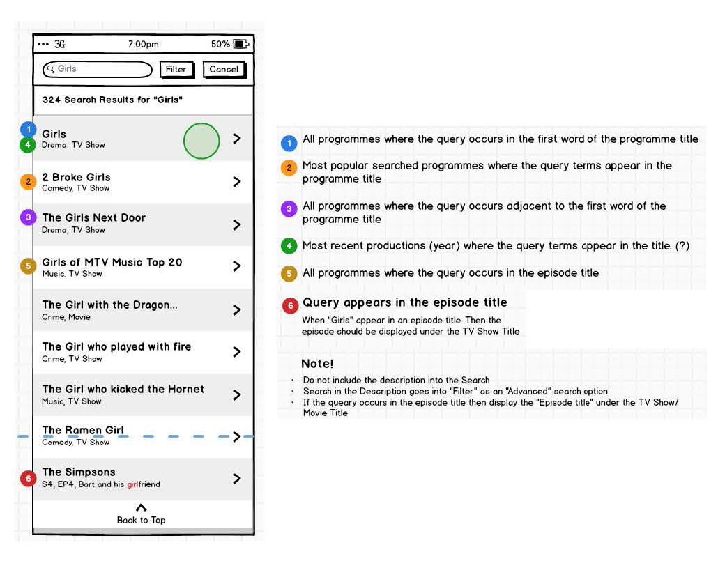
- User Scenario: As a user, I would like to find the “Girls” TV show, so I can start watching asap.
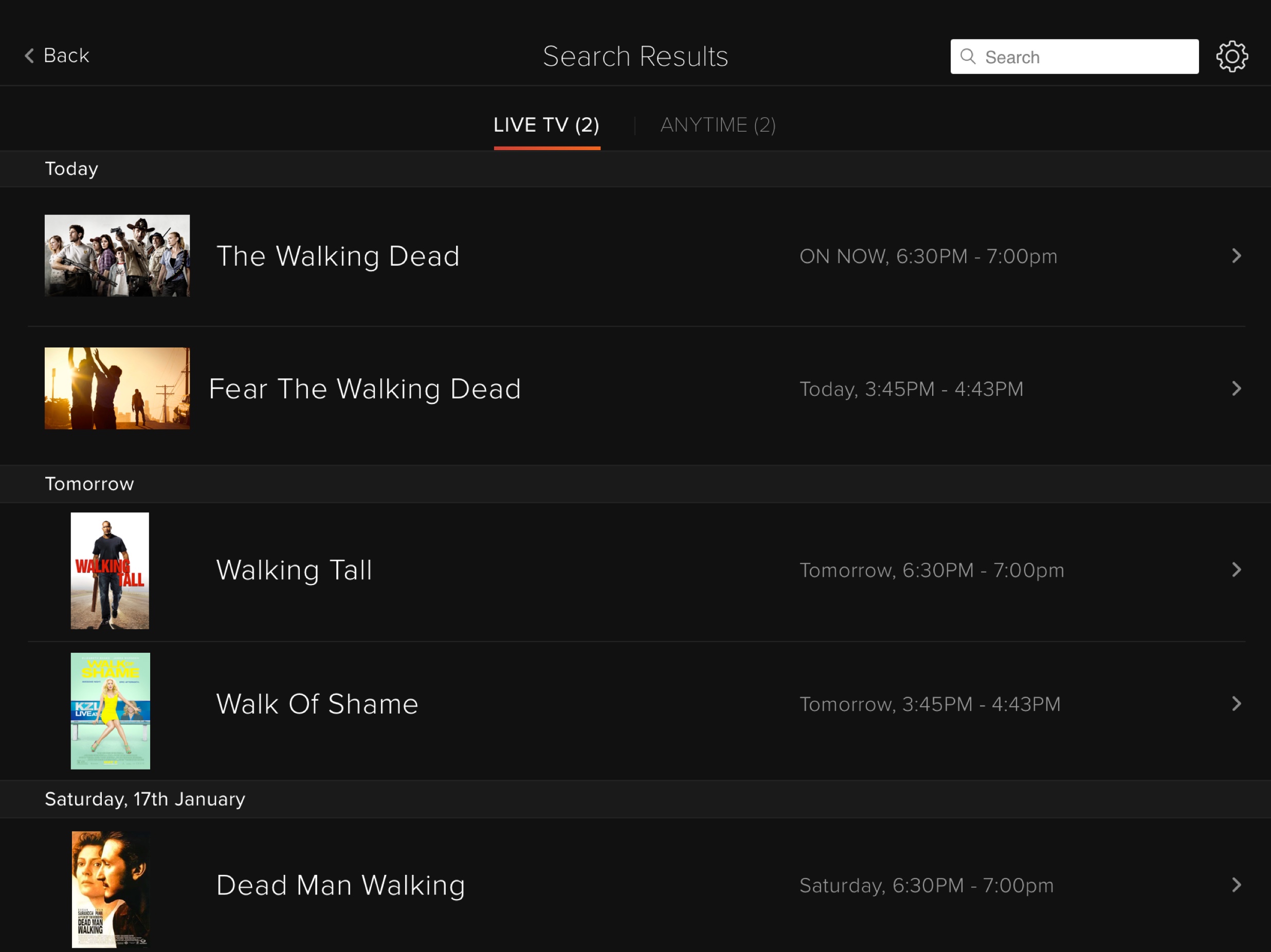
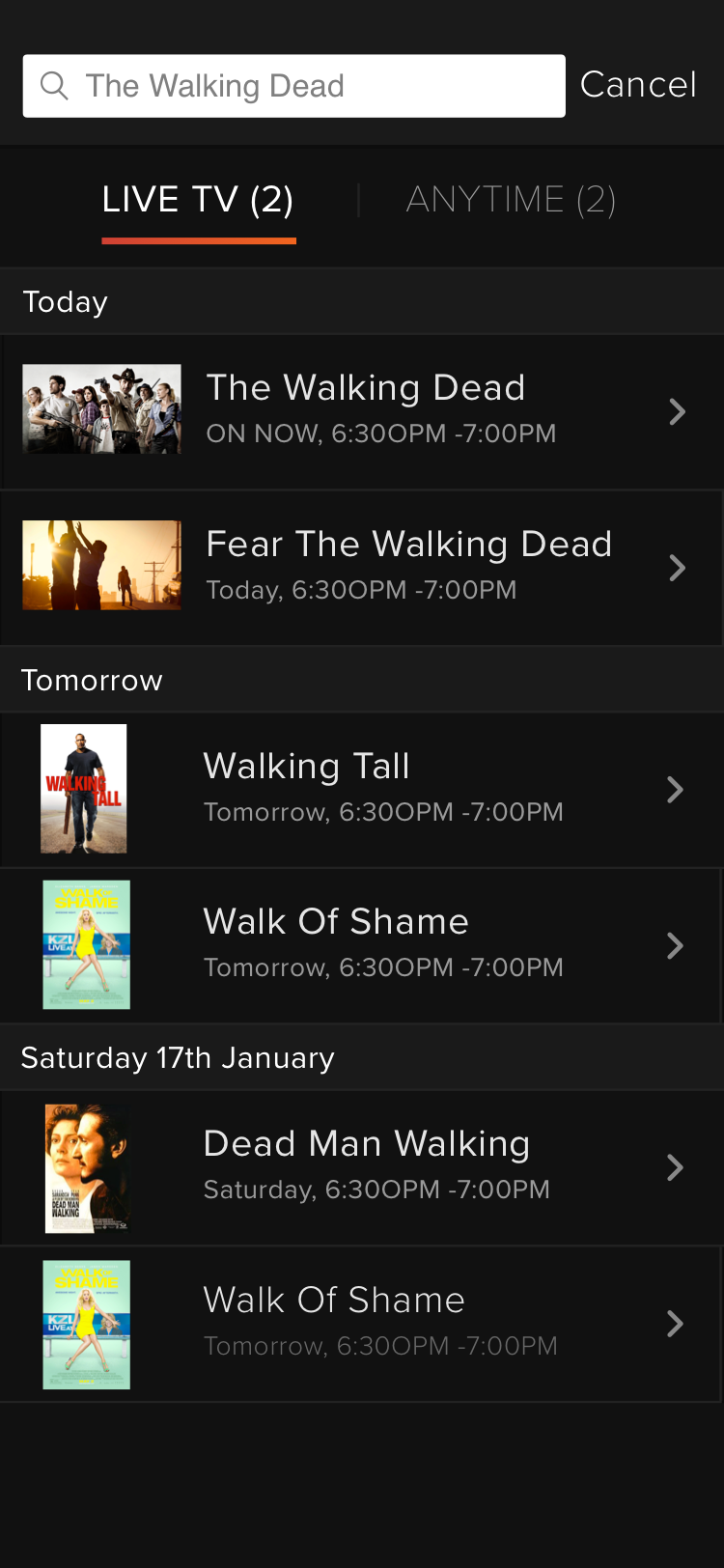
- Problem: When users searched for content e.g. “Girls”, the results were displayed by episodes. This resulted in a long list of results that was very difficult to scan. E.g. 50 episodes for Girls were being displayed.
- Solution: Roll up results by the program title. All results with the same title should be rolled up to avoid long repetitive lists.
- User Scenario: As a user, when I search for the “Girls” TV show, I often find unrelated content that is not what I’m looking for.
- Problem: When users searched for content e.g. “Girls”, the results presented were any program that contained the query “Girls” within its metadata without any sort of relevancy ranking. This resulted in a long list of results without any order criteria.
- Solution: Create a search relevance ranking that allows the search engine to display results in a way that match the user’s mental model.
Concept Design
Testing
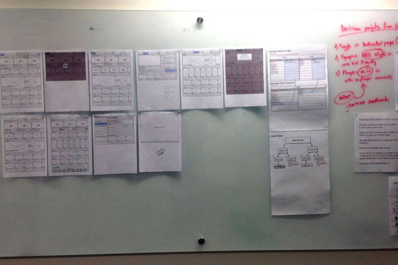
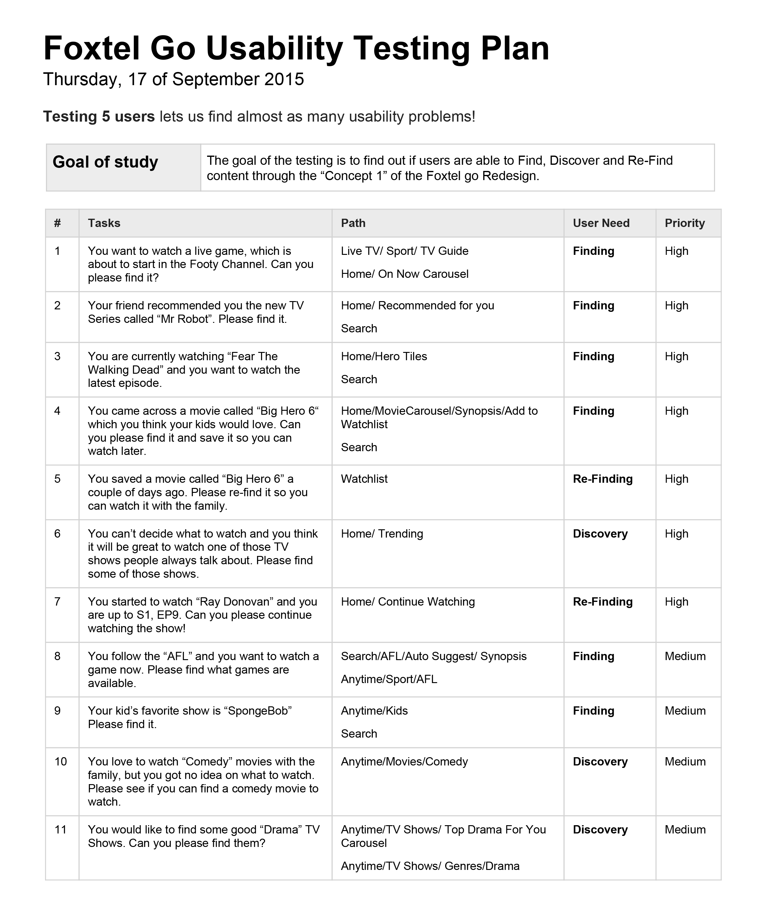
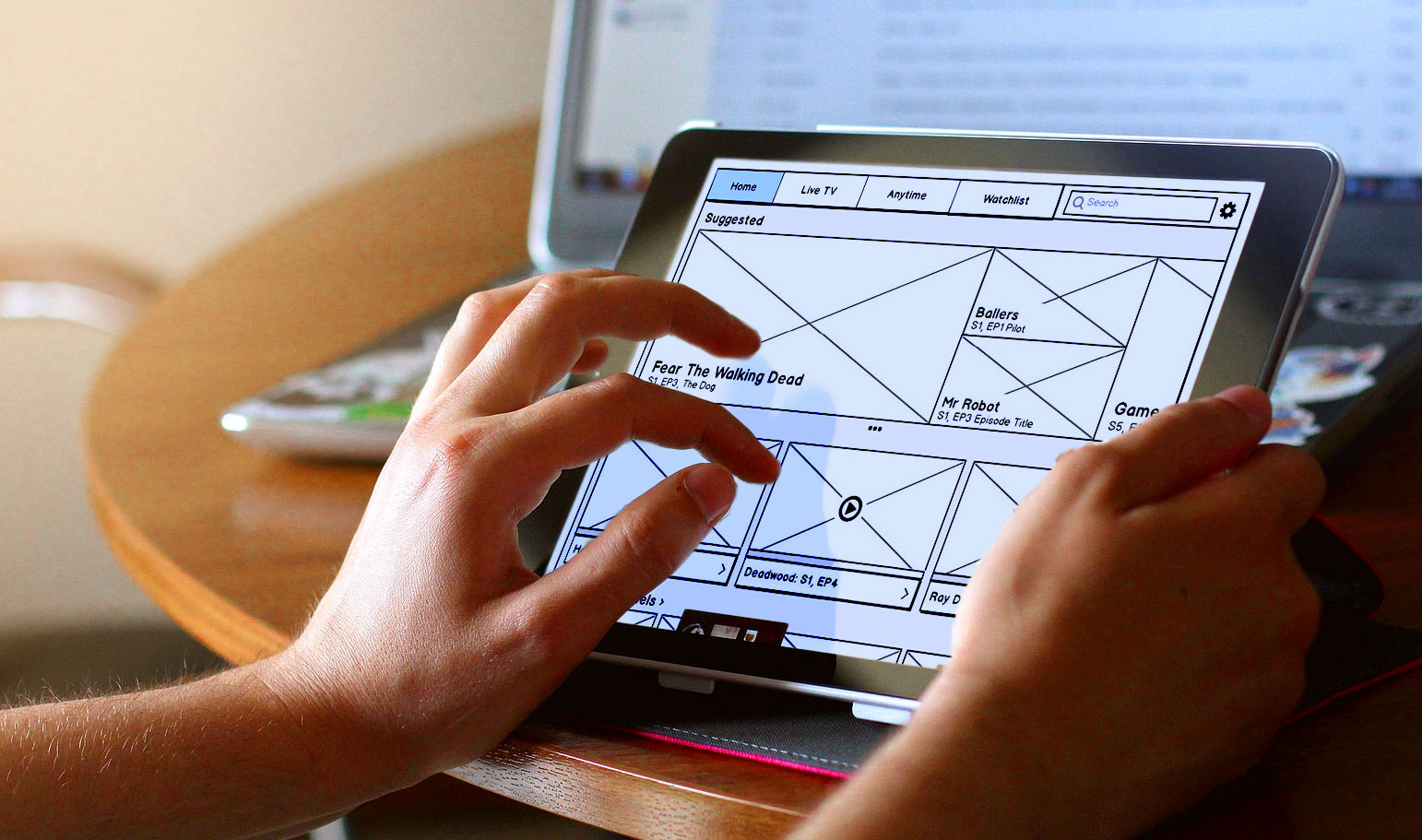
The wireframes were tested with 5 users who gave us valuable feedback and helped us to identify potential issues in the interface and navigation.
User Interface Design
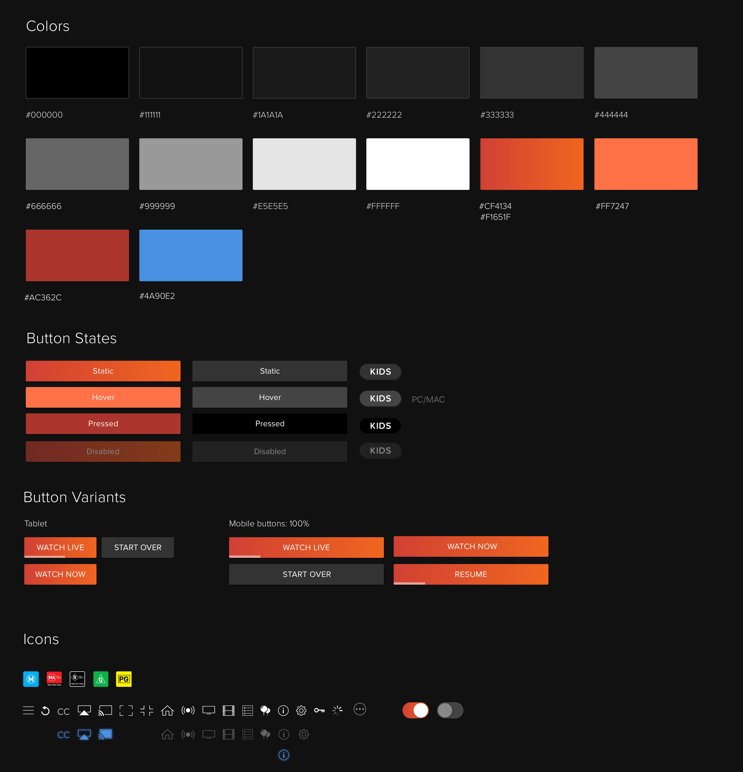
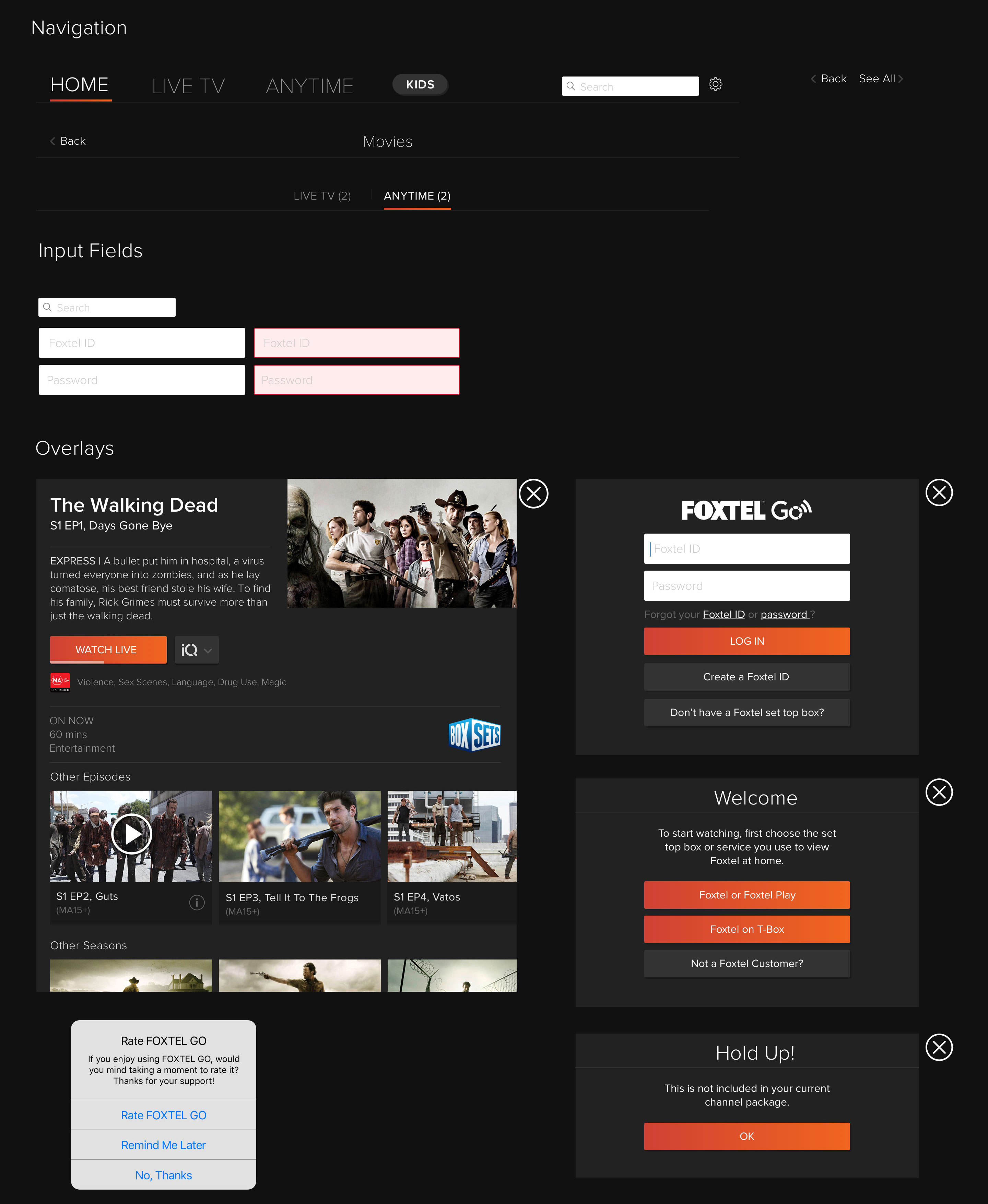
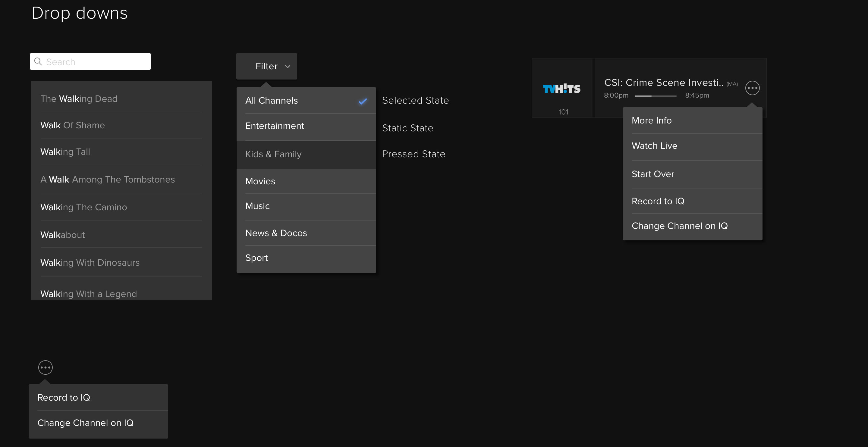
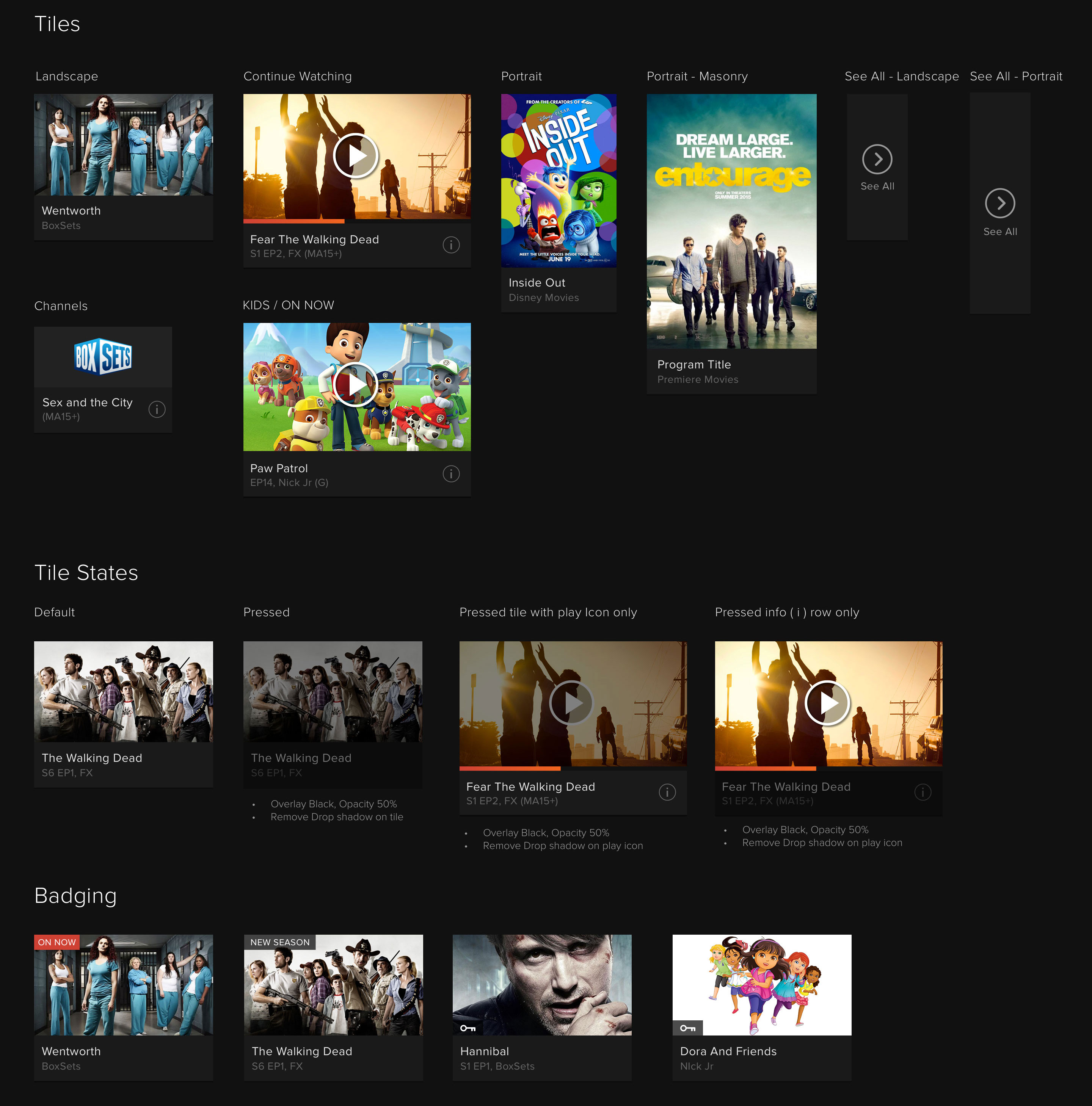
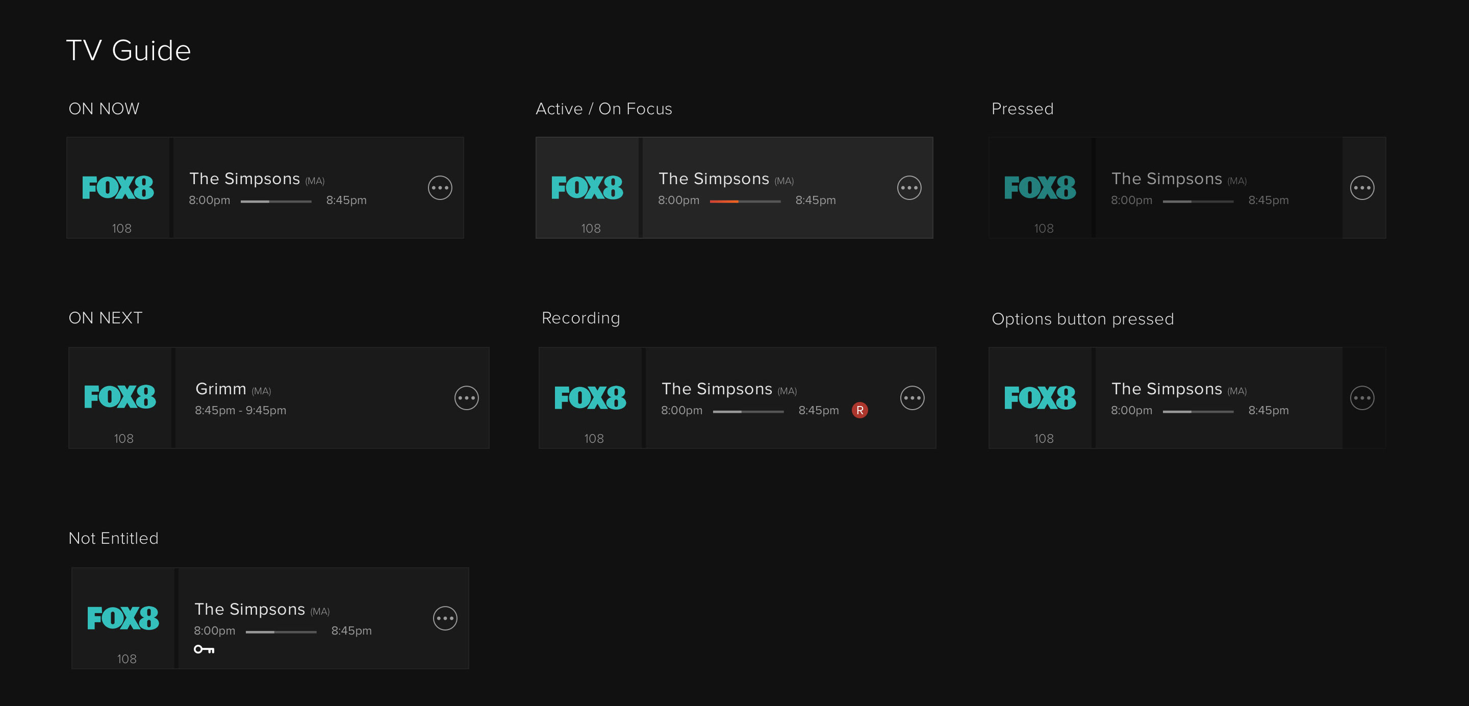
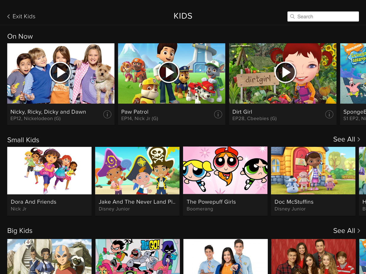
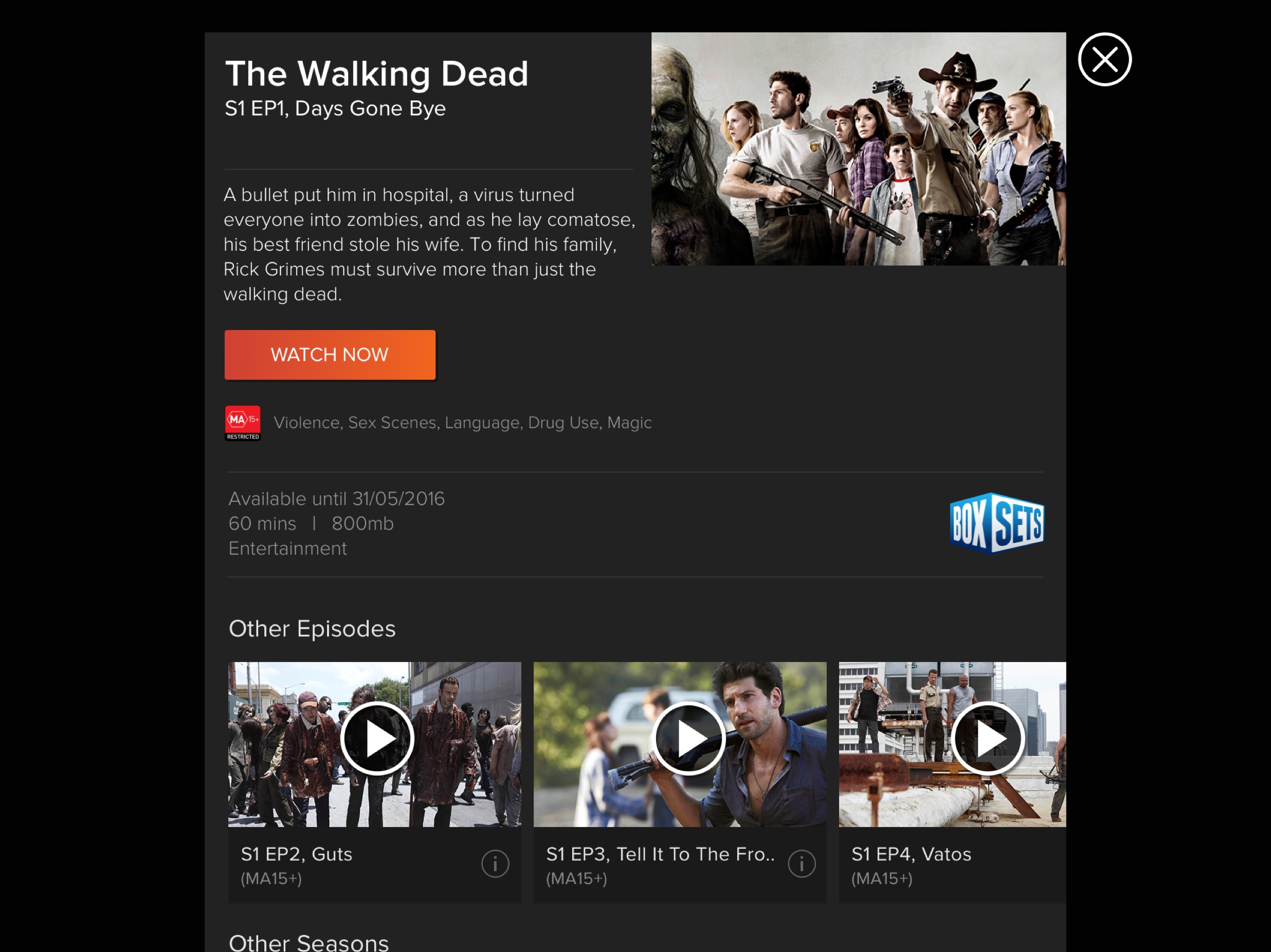
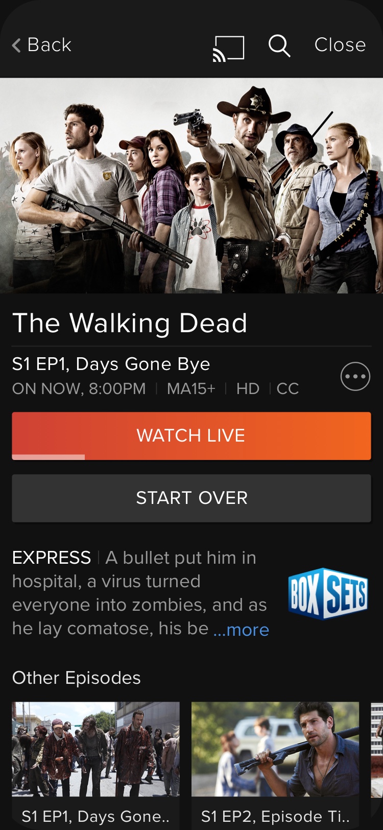
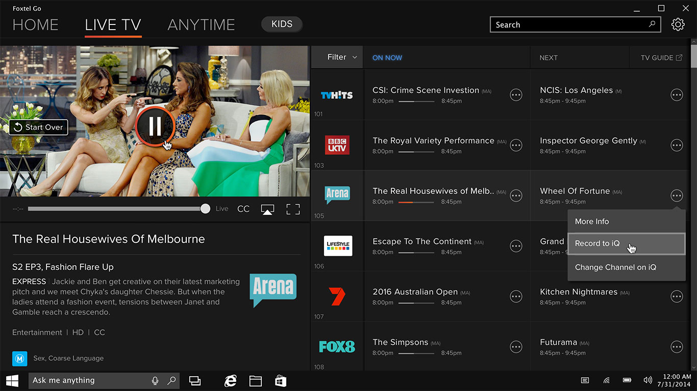
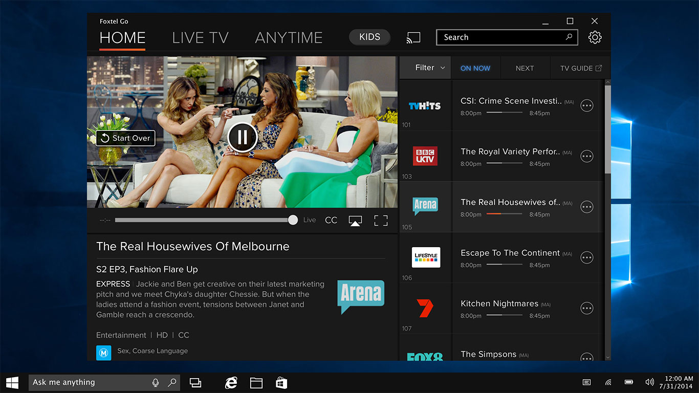
The UI Design challenge was to bring the experience closer to the IQ3 (Foxtel set-top box) as well as simplifying current features and integrating seamlessly the new ones.
Cross-Platform Design
Tablet
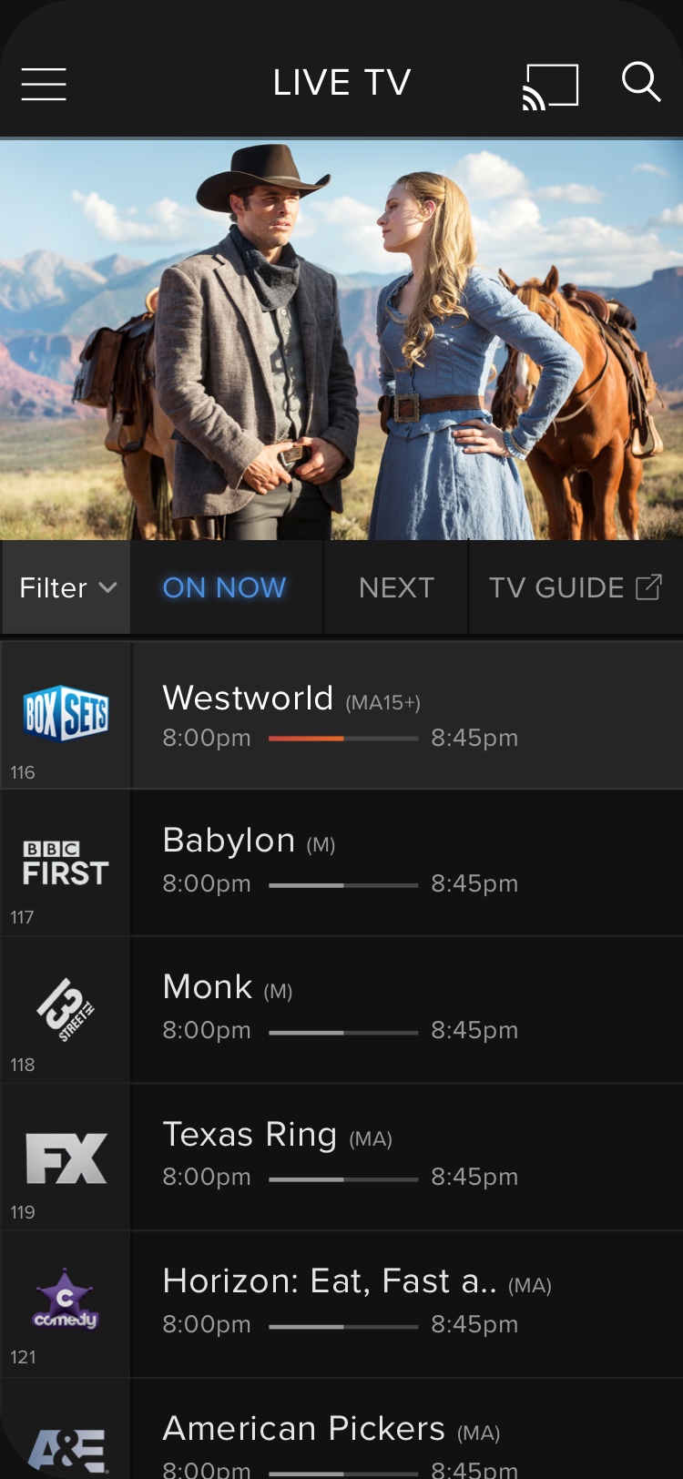
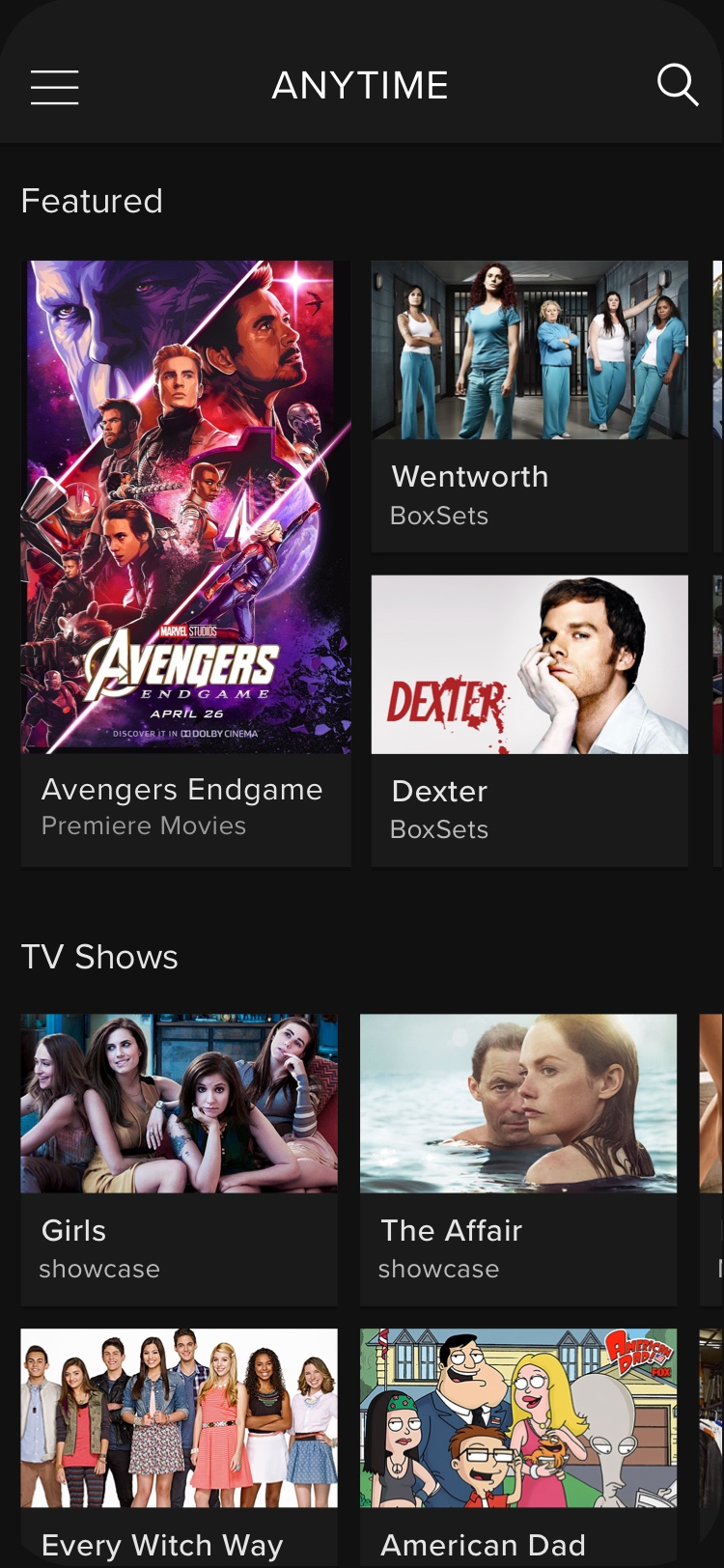
Mobile
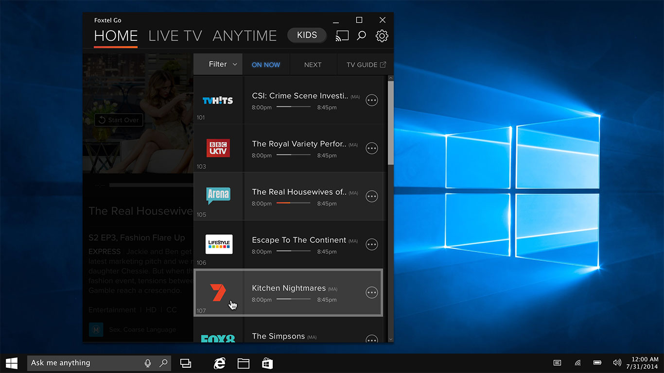
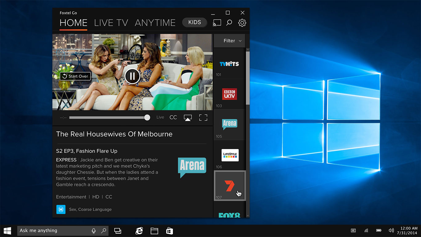
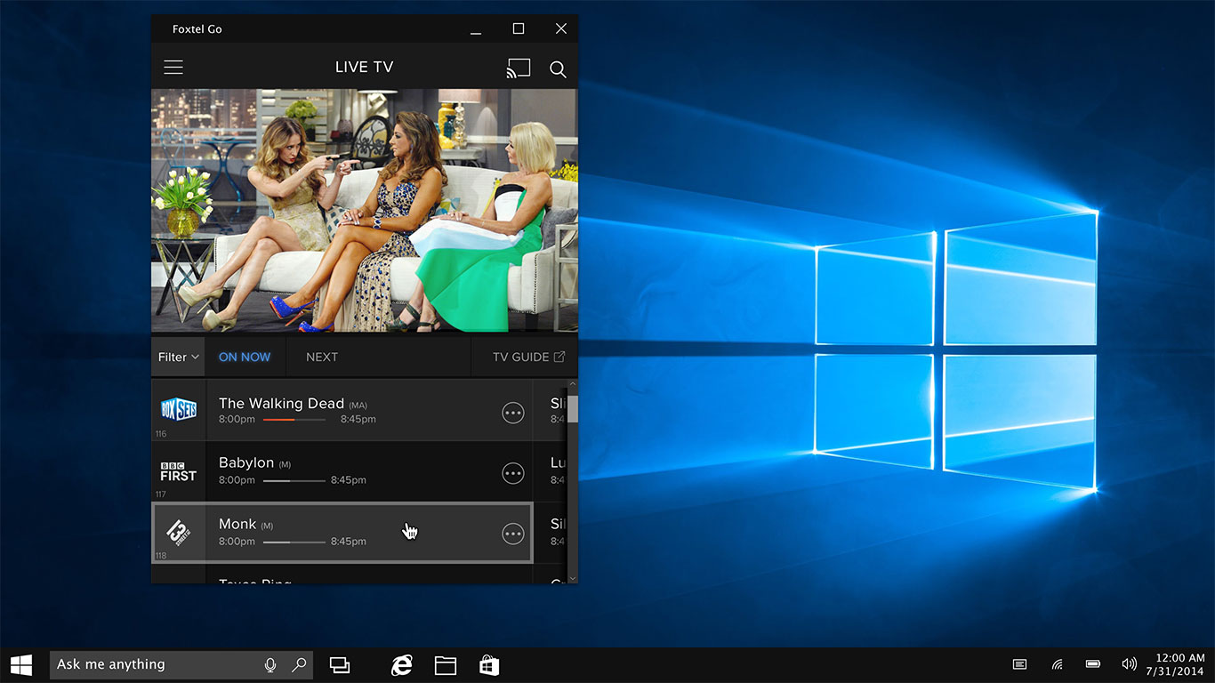
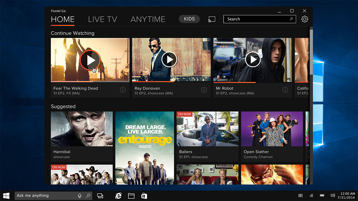
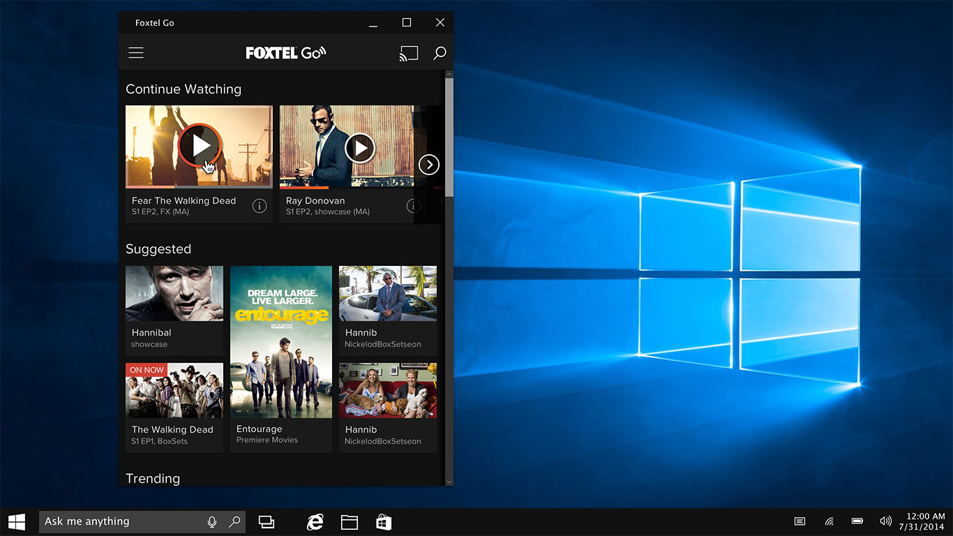
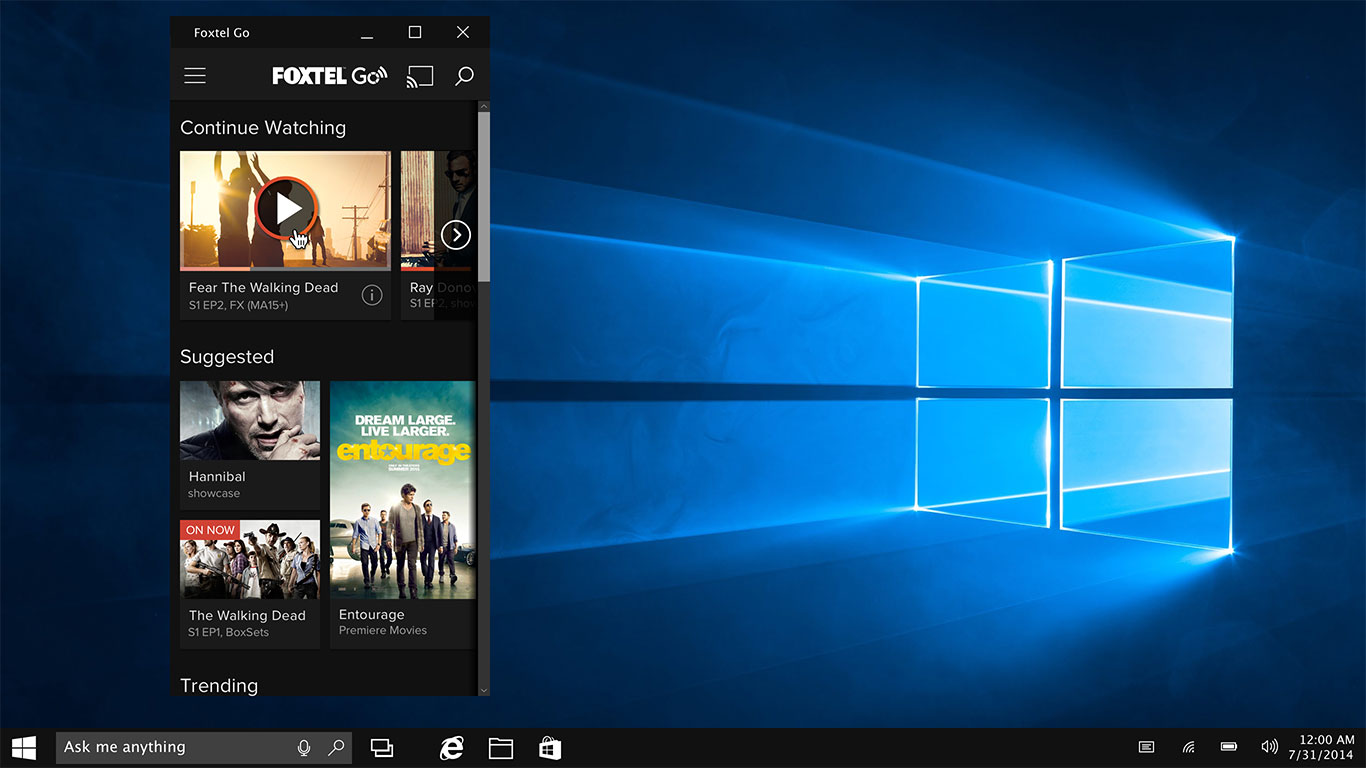
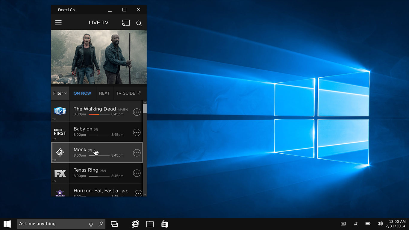
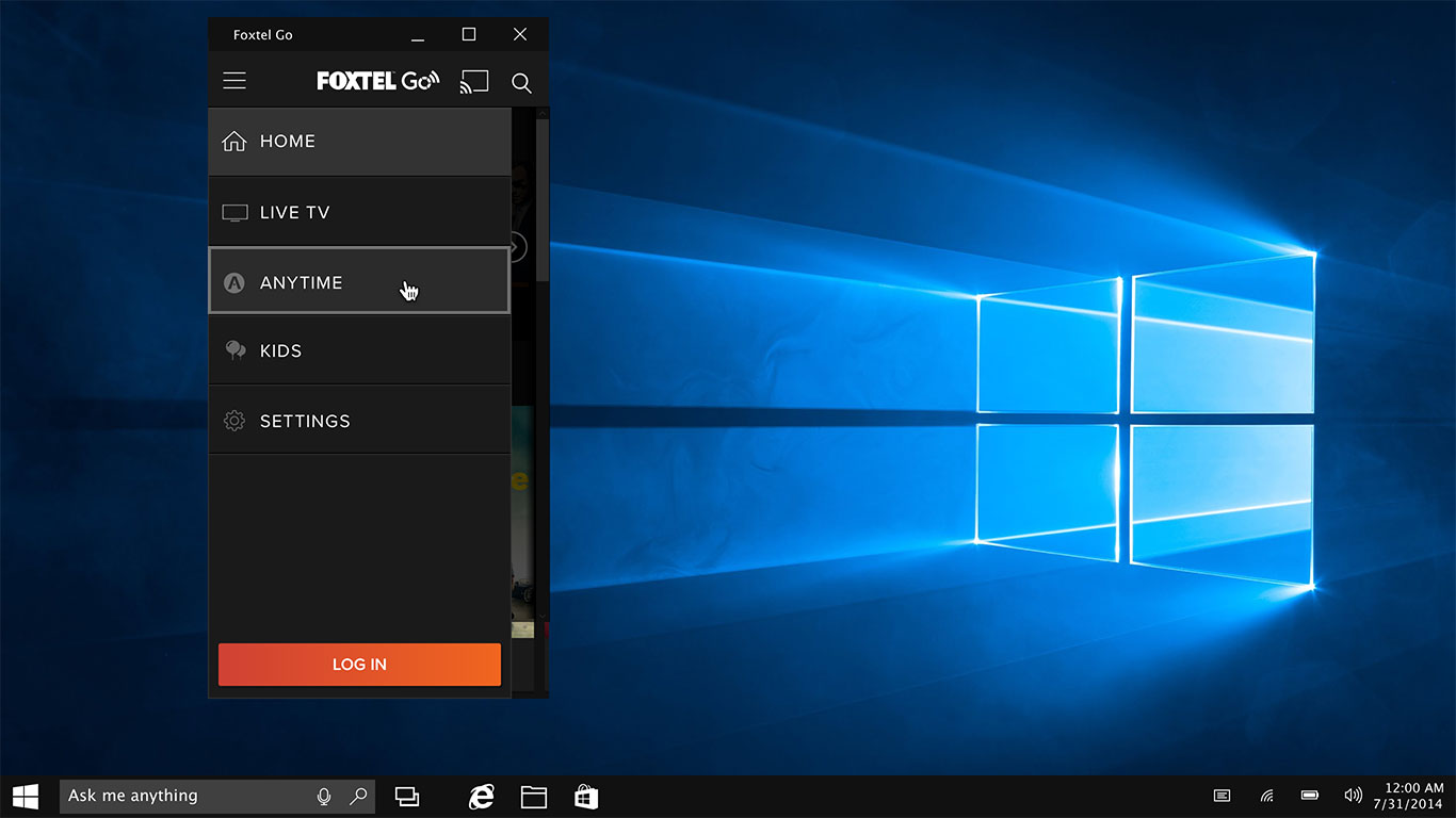
Windows 10
Thanks for reading!
CX Team: Vincent - Dona - Nolan - Juan

