Lysn Health 2.0
Lysn Health is a mental health startup that offers professional support with qualified Australian psychologists. Counselling, Coaching, Wellbeing Tools and Education. In 2019, I led the redesign of Lysn 2.0
Summary
When I arrived at Lysn in 2018, I started working from a functional MVP. My main goal was to identify opportunities to improve the product and its user experience, design new features on the road map, and, of course, create a beautiful and modern user interface. In order to achieve this, I researched the current landscape of mental health in Australia, I analyzed existing user research and worked closely with the founder to understand business goals. I ran design workshops with the lead psychologist to understand the psychologist's needs, ideated with stakeholders to design new features, maintained good communication with the developers to validate the feasibility of the solutions designed, and created a scalable design system. I managed a mid-level UI designer, who helped me with the nitty-gritty UI design tasks. The v2.0 of Lysn was successfully released in March 2019, and it's currently being used by thousands of Australians.
Discovery
The landscape
I started by analyzing the current landscape of mental health in Australia. This is what I found:
20%
One in five Australians aged 16-85 experience mental illness in a year
45%
Australians will experience mental illness in their life time
18-24
Years old, have the highest prevalence of mental illness
54%
of people with mental illness do not access any treatment
Research sources: https://www.blackdoginstitute.org.au/docs/default-source/factsheets/facts_figures.pdf?sfvrsn=8
Business Analysis
Lysn’s goal is to connect people seeking help with qualified Australian psychologists. However, in order to really make an impact and improve the mental-health crisis in Australia, Lysn needed to do more. For this reason, I researched and analyzed competitors like Betterhelp and Talkspace in order to find opportunities and gaps in the market. This is what I found:
- All big competitors are based in the US and offer online-therapy services worldwide.
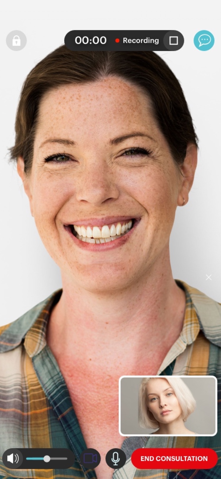
- Betterhelp offered “Chat” counseling. This seemed an obvious opportunity for Lysn, I proposed to include “Chat” as a consultation type. I designed a few concepts to demonstrate how this new future could be integrated into the platform.
- Most competitors in Australia focused on either online or face to face therapy. No competitor was doing both. This was a big opportunity for Lysn to provide more value to its users and expand their business possibilities. Offering “Face to Face” consultations became one of our main goals
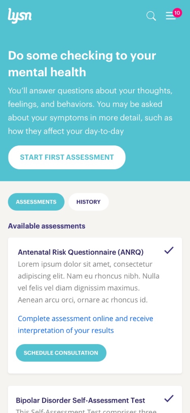
- Most mental-health platforms force users to complete long questionnaires as their on-boarding experience. This process causes a lot of friction due to the cognitive overload that answering 20+ questions causes. It’s a painful process for new users.
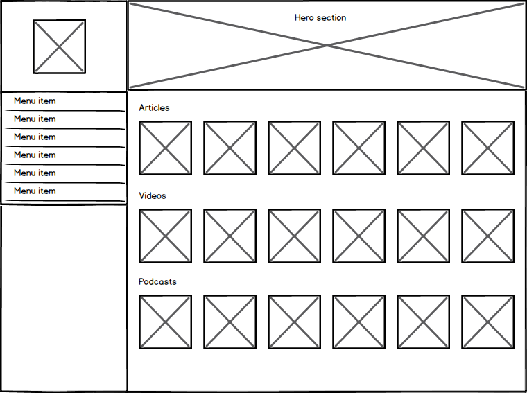
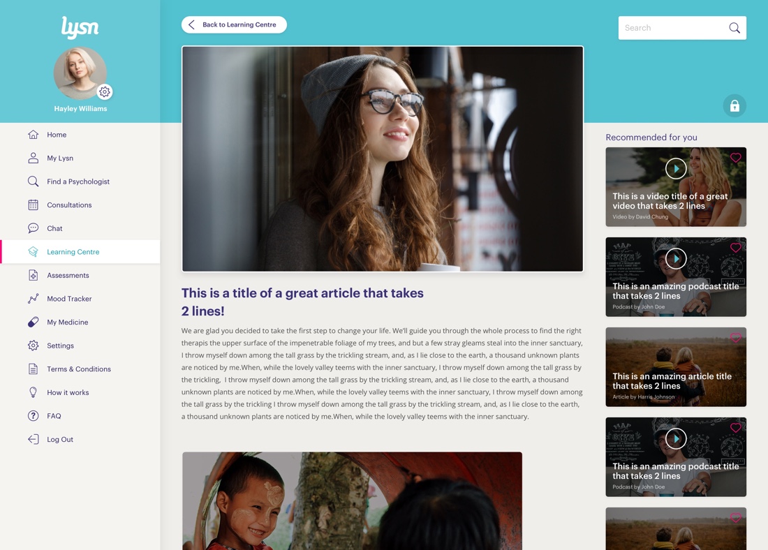
- Blog content is being used to provide mental health education and advice. I proposed to start investing in this.
- Most psychologists CRMs platforms are outdated and with poor usability. Psychologists usually used native software applications that looked like they were designed in the 90s.
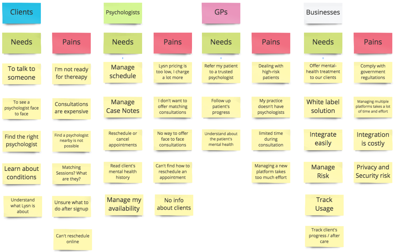
Understanding The Users
My goal was to gain a clear understanding of Lysn’s users so we could focus on designing features and delivering the product. To do that, I researched customer feedback and performed user interviews. I mapped out the main user needs and pain points for each type of user.
Lysn-personas
Psychologist's Journey
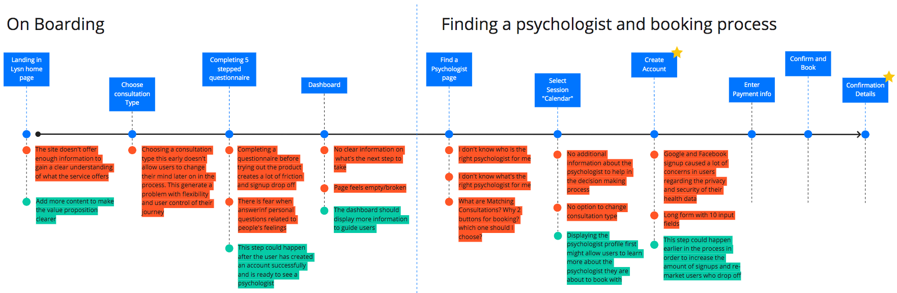
Client User Journey
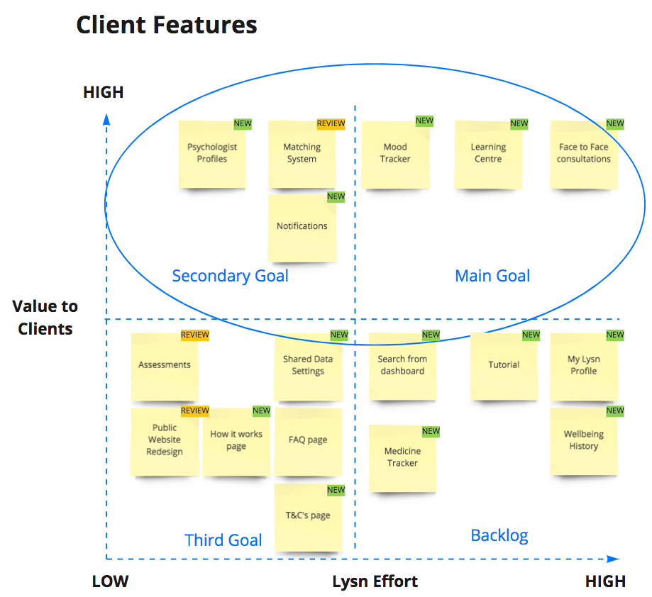
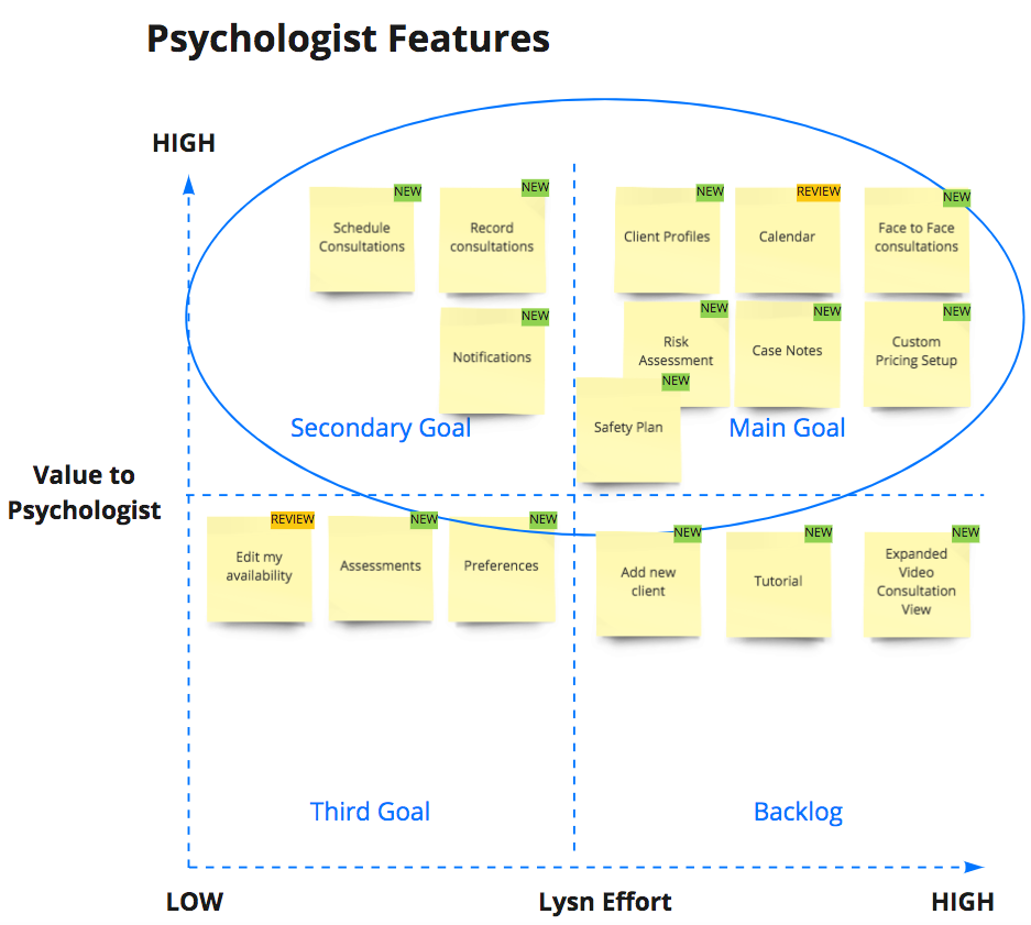
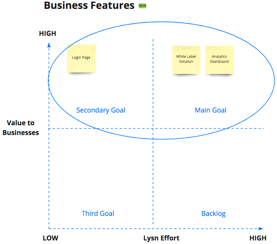
Features Prioritization
No complex or fancy formulas. Just effective communication between the stakeholders, head of development and design (myself). Each one of us had its own criteria. Mine? How much effort would take the design team to work on a specific feature and how much value it would provide to the user?. When talking about value to the user, I observe the frequency of the user needs or pain points. Does it happen often? Does it need to get solved ASAP? Is it a common complaint/issue?
Ideation
At Lysn, ideation happened in the form of design workshops and conversations with the stakeholders. These are some of what I brought to the table:
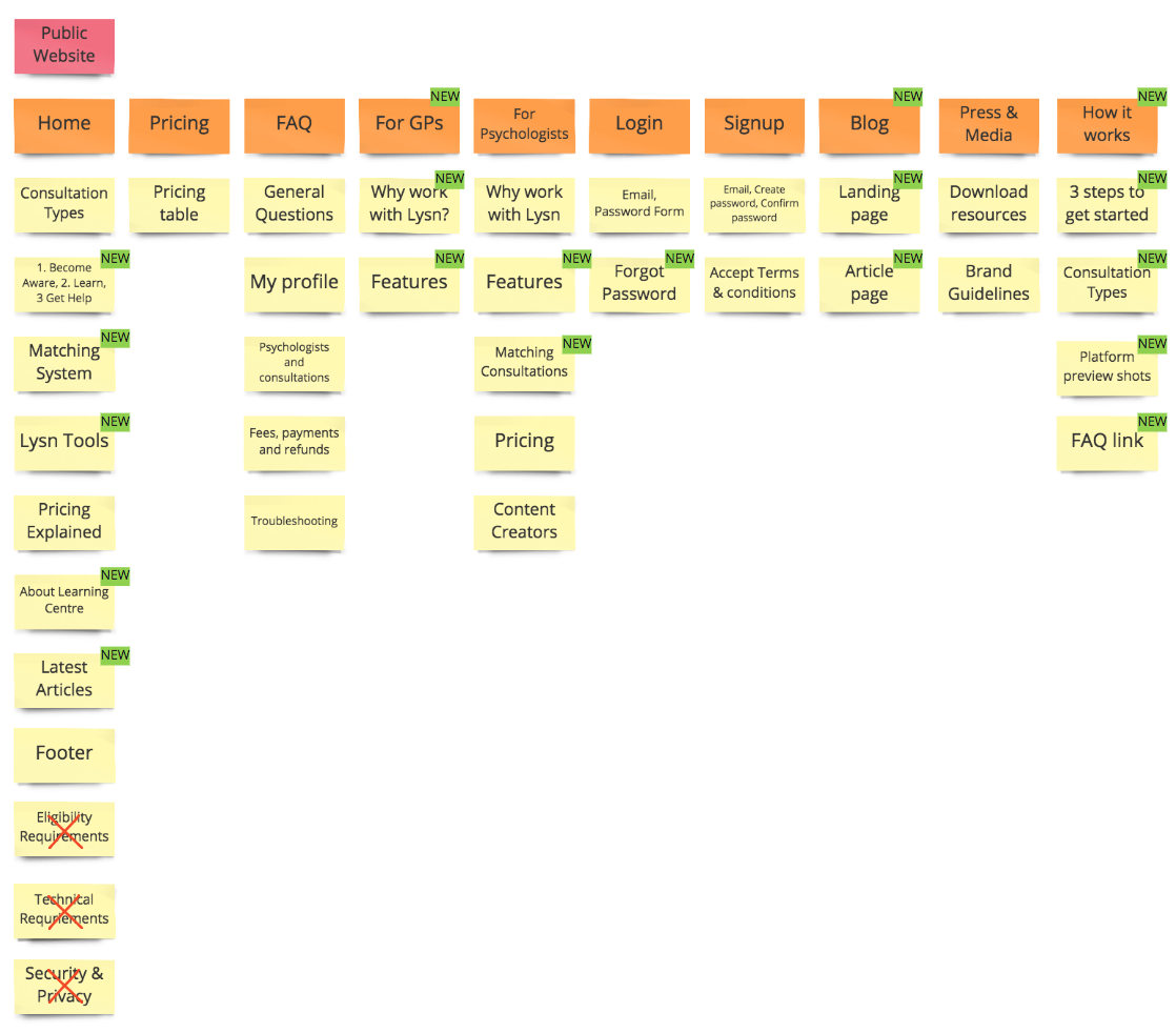
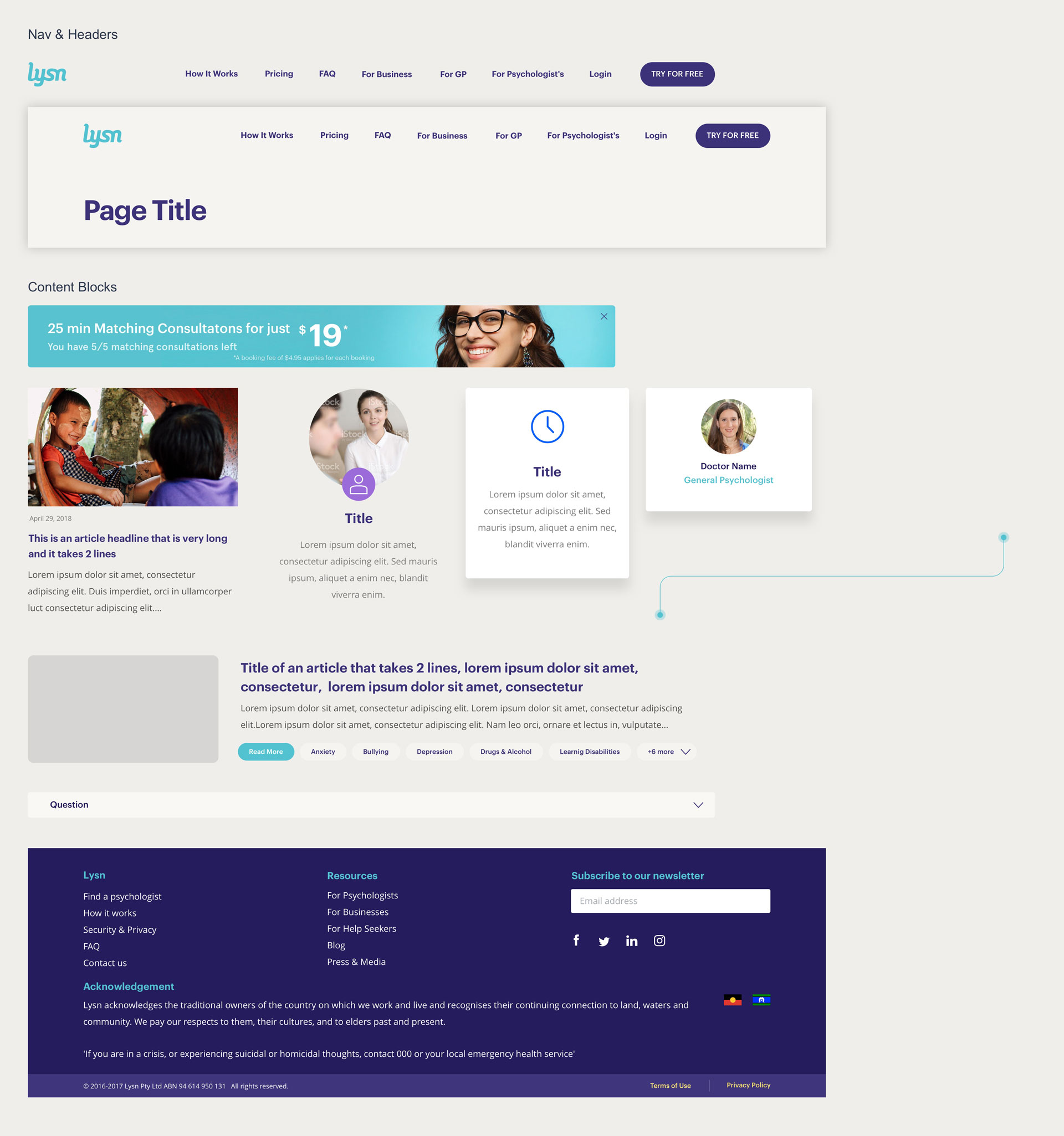
Public Website
The lack of content wasn’t helping users to gain a clear understanding of the value of Lysn. I proposed to add several content sections to improve this.
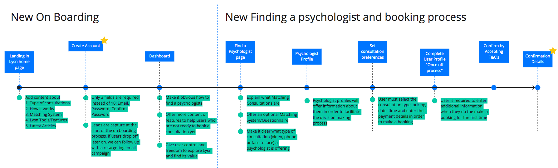
Client’s On-Boarding
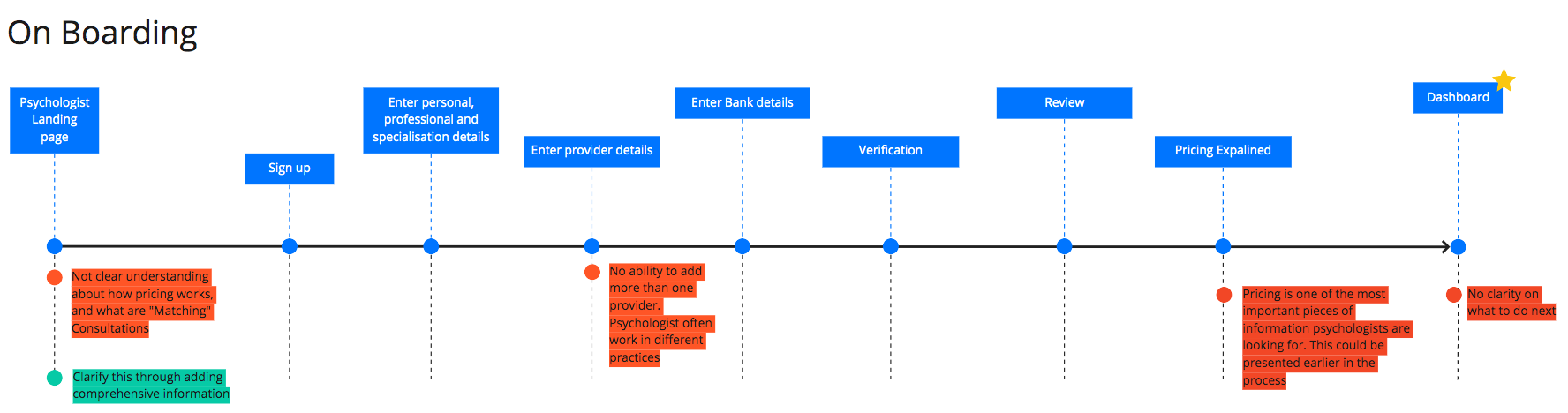
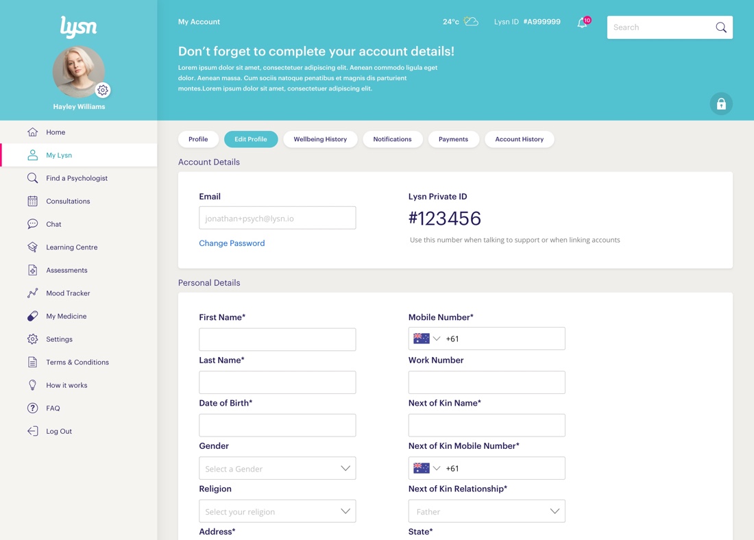
Lysn was using a late signup process, which pushed users to choose a consultation type, answer a questionnaire, find a psychologist, and select a session before even creating an account. The issue I identified, is that users were forced to take a lot of granular decisions very early in the process. This resulted in cognitive overload, which led users to drop off when answering the questionnaire (as found in usage analytics). I proposed to create a journey that goes from a high-level decision into more granular decisions later on in the process. Simply by allowing users to create an account and later on asking all the additional questions. I proposed to implement an early signup process that only required email + password in order to access the platform. This also enables users to explore and find value within the service first. Additionally, users were concerned about the security and privacy of their data when signing up through Facebook or Google. The team agreed to only use email to mitigate this.
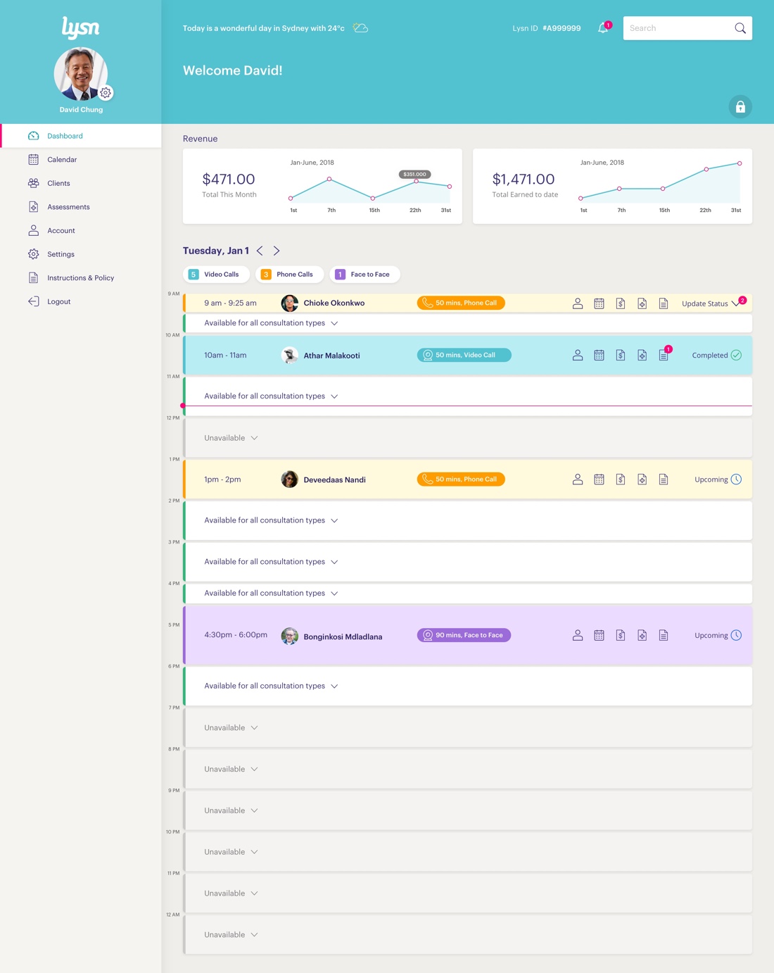
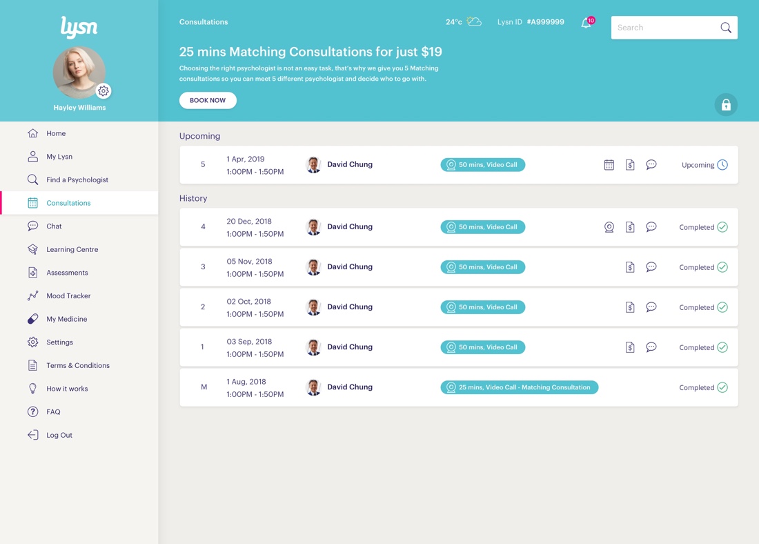
Dashboard
When first landing in the dashboard, Lysn looked empty for both clients and psychologists. This caused confusion in users because it wasn’t clear what was the next step they needed to take. I proposed to create an experience that shows the key features of Lysn. Keeping “Find a psychologist” as the center of the user interface.
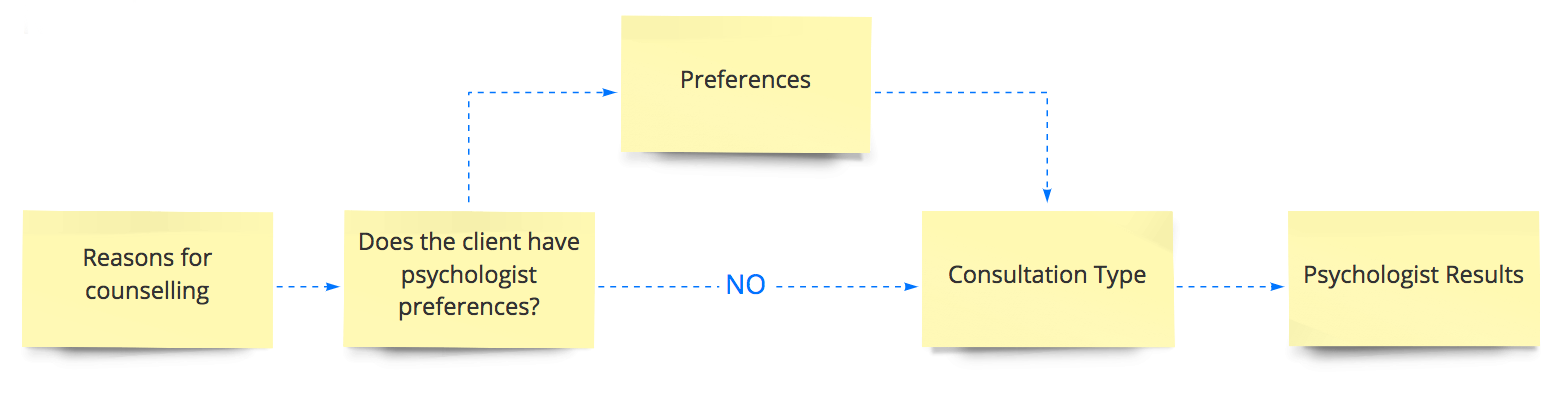
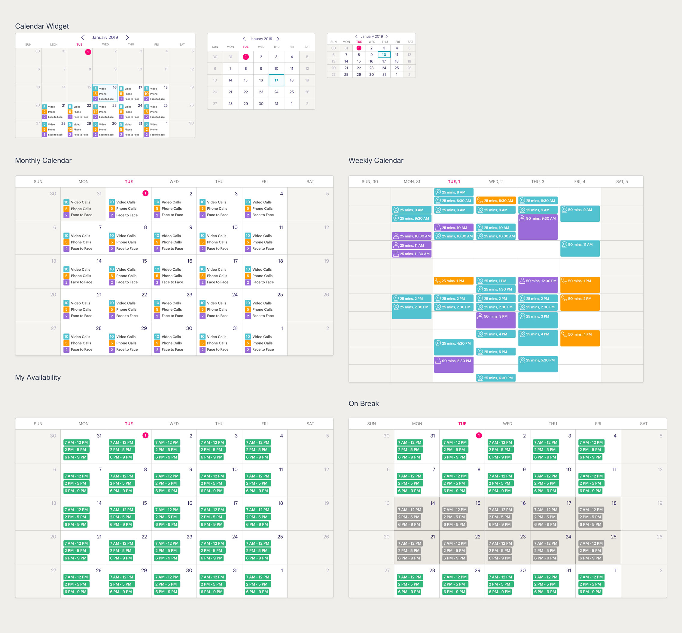
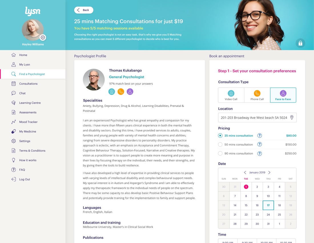
Matching System
Lysn used the questionnaire to match clients with psychologists. The problem was that not all users weren’t ready to book a consultation, but we were pushing them to complete it. I proposed to make the questionnaire optional as an added feature called the “Advanced Matching System”. I explored various solutions that I workshopped with the team. After 3 iterations we were able to simplify the matching system like this:
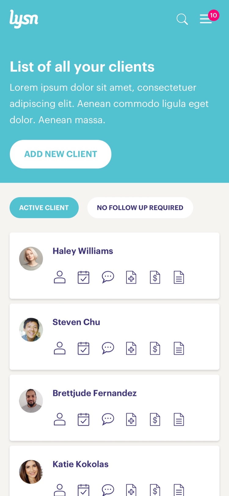
User Profiles
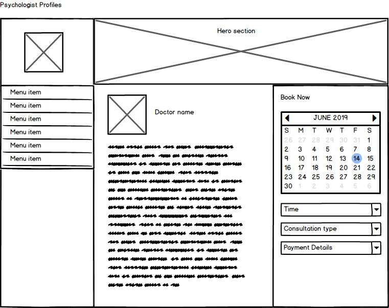
Clients constantly struggled to decide who is the right psychologists for them. Yet, the platform only offered a small psychologist’s profile description in the results page. This didn’t offer enough information to the user in order to take a decision. I proposed to include the psychologist profile as part of the booking journey.
In the other hand, psychologists only had access to basic contact information. I proposed to create a client’s profiles that contained all the client’s “health-record”. This would empower psychologist in their practice.
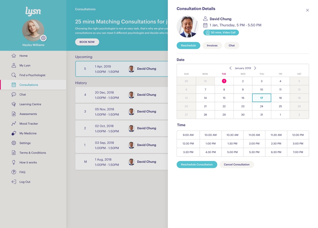
Consultation Types
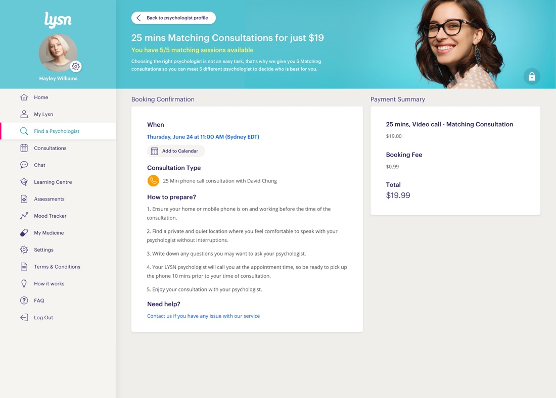
A Phone call or video call? What am I booking?. There wasn’t enough clarity on what the user was booking. I proposed to make this visible and straight forward in order to enable users to make an informed decision when booking.
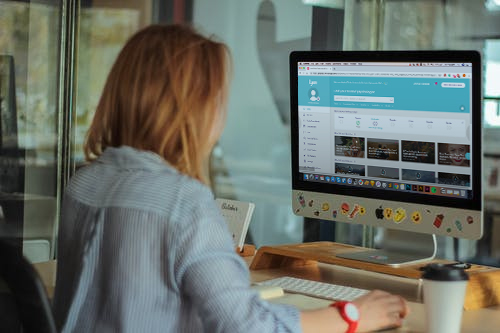
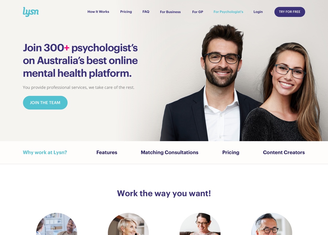
Psychologist Platform
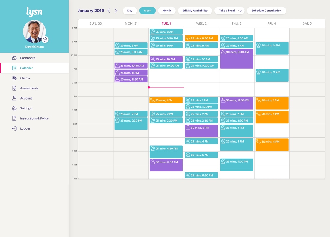
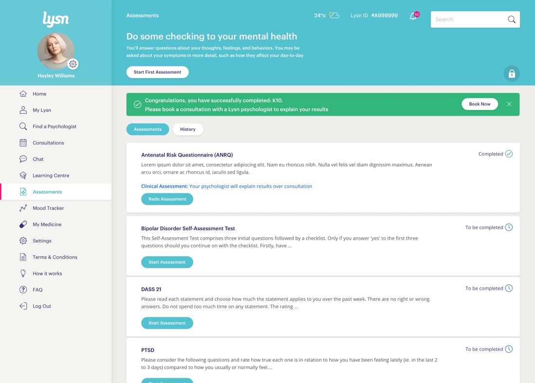
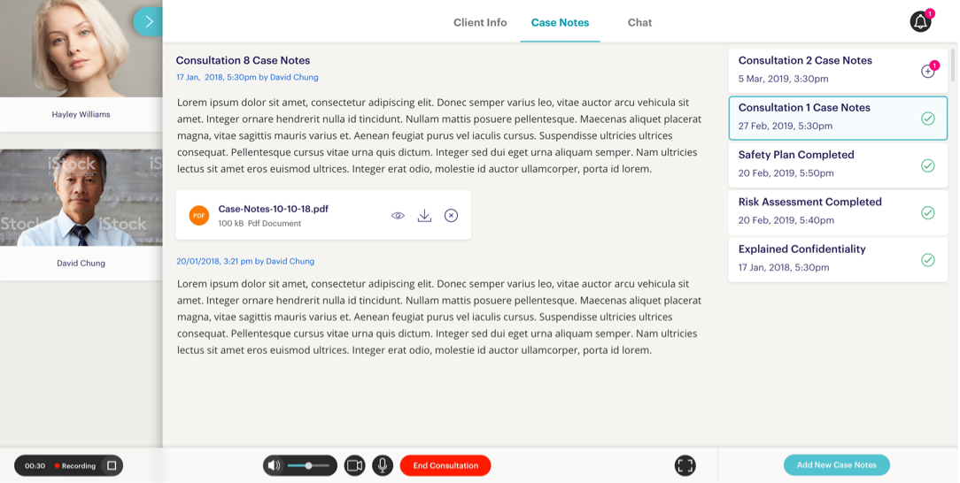
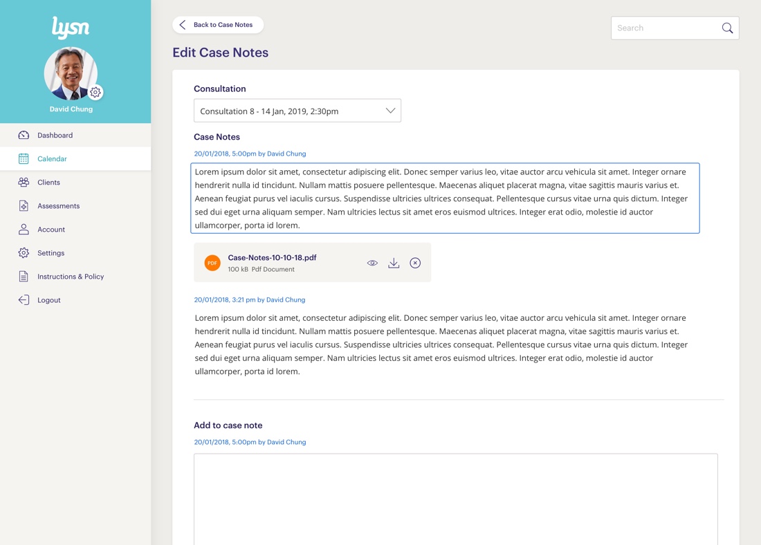
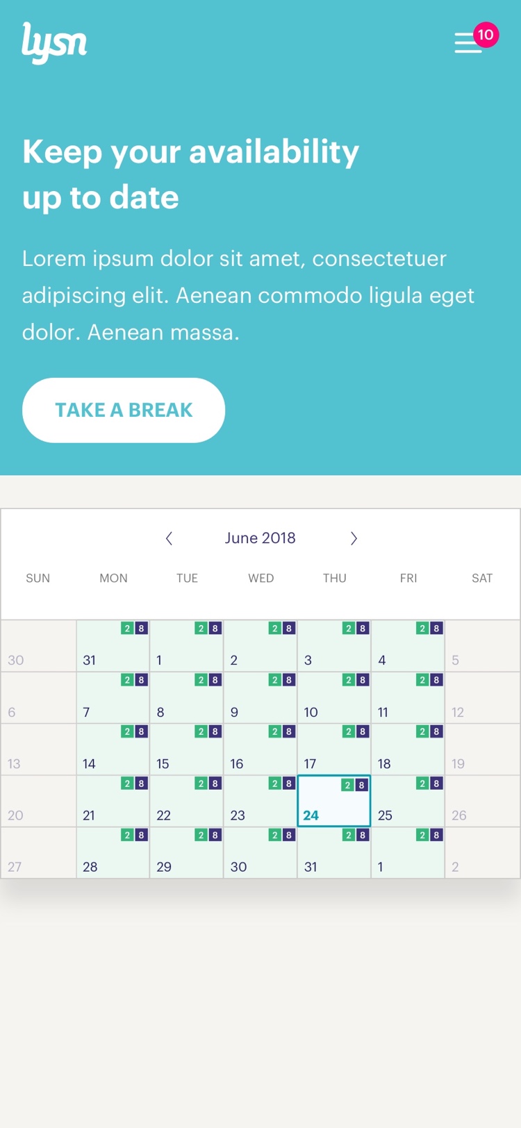
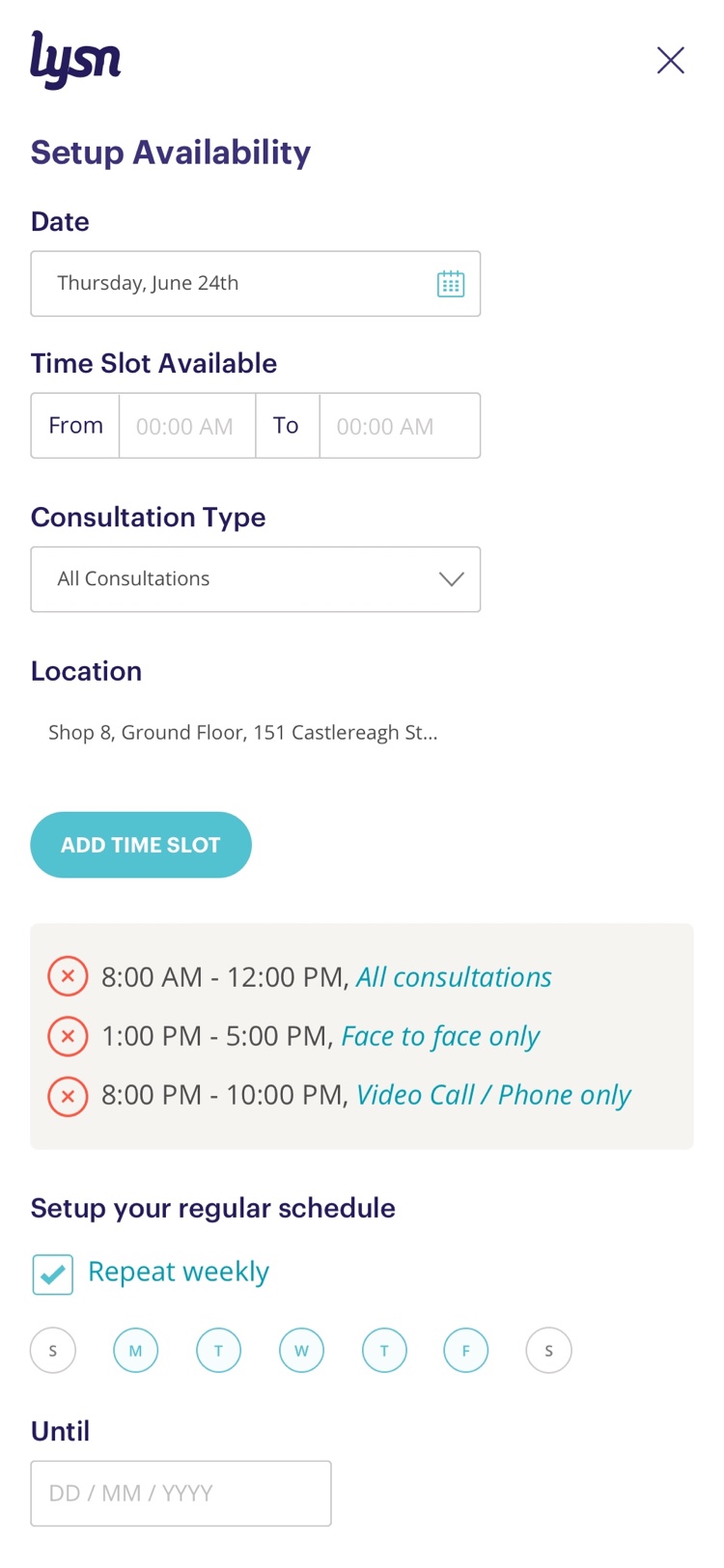
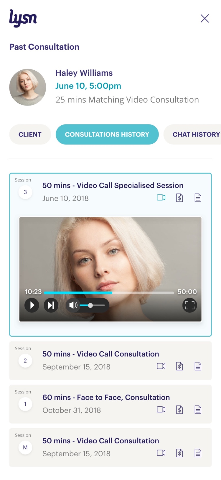
The team was able to identify several missing features that were very common for psychologists in their daily practice. I worked closely with the lead psychologist in the ideation and design of case notes, calendar, setup availability, video consultation interface, risk assessment, and safety plan processes.
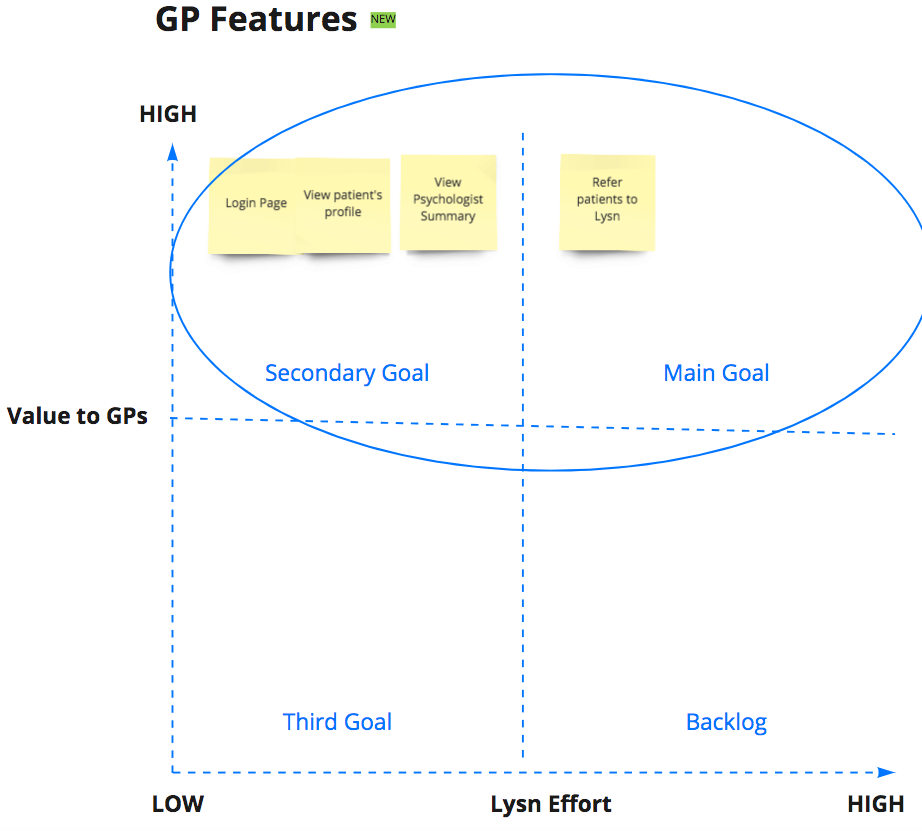
GPs Platform
General Practitioners usually act as the first mental-health aid. They have to deal with patients with all sorts of conditions. Our challenge was to build an interface to enable GPs to refer clients to Lysn.
White Label Solution for Businesses
Enabling Lysn to offer its platform as a white label solution will open numerous b2b opportunities and partnerships. To do that, I proposed to create a flexible and scalable design system that allowed us to effectively fit any brand.
Design System
Managing Design
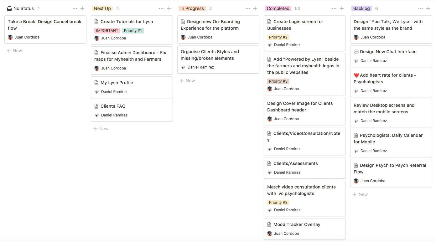
I led and mentored a mid-level UI Designer who helped me with some of the UI work. I used a Notion Kanban Board to help the team organize the tasks and track progress. I was responsible for creating actionable tasks from business requirements, workshop outcomes and conversations with stakeholders. This helped us to keep the team accountable and keep track of the progress.
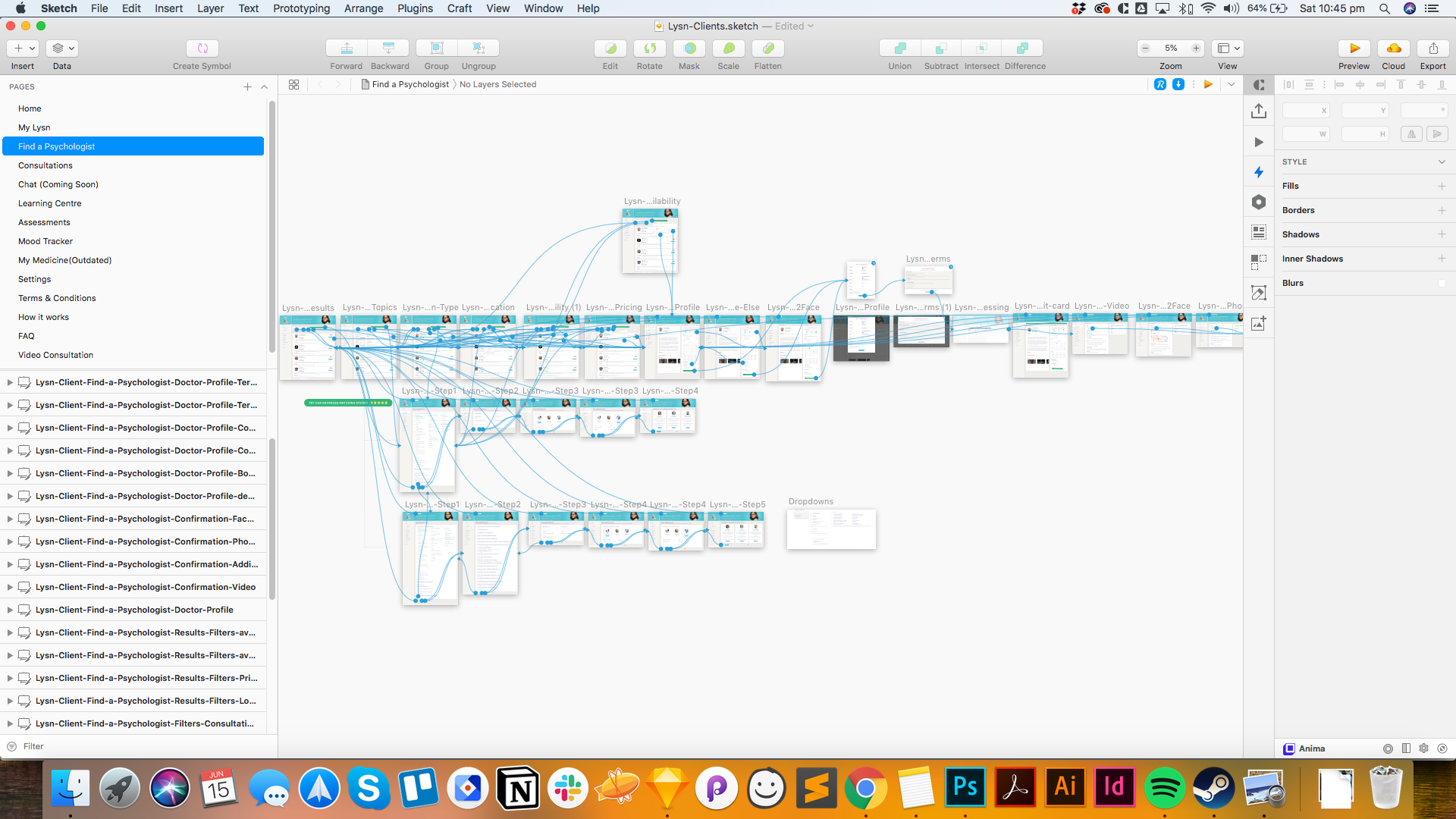
File Structure
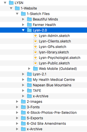
When dealing with design files, I encouraged designers to keep consistent and organized file structure with comprehensive naming to facilitate collaboration. I prefer using numbers to create a folders hierarchy and keep all versions of the files. Instead of deleting files, we moved them into an x-Archive folder that contains all the old iterations of a file. In this way, we always keep previous versions in case we need them again.
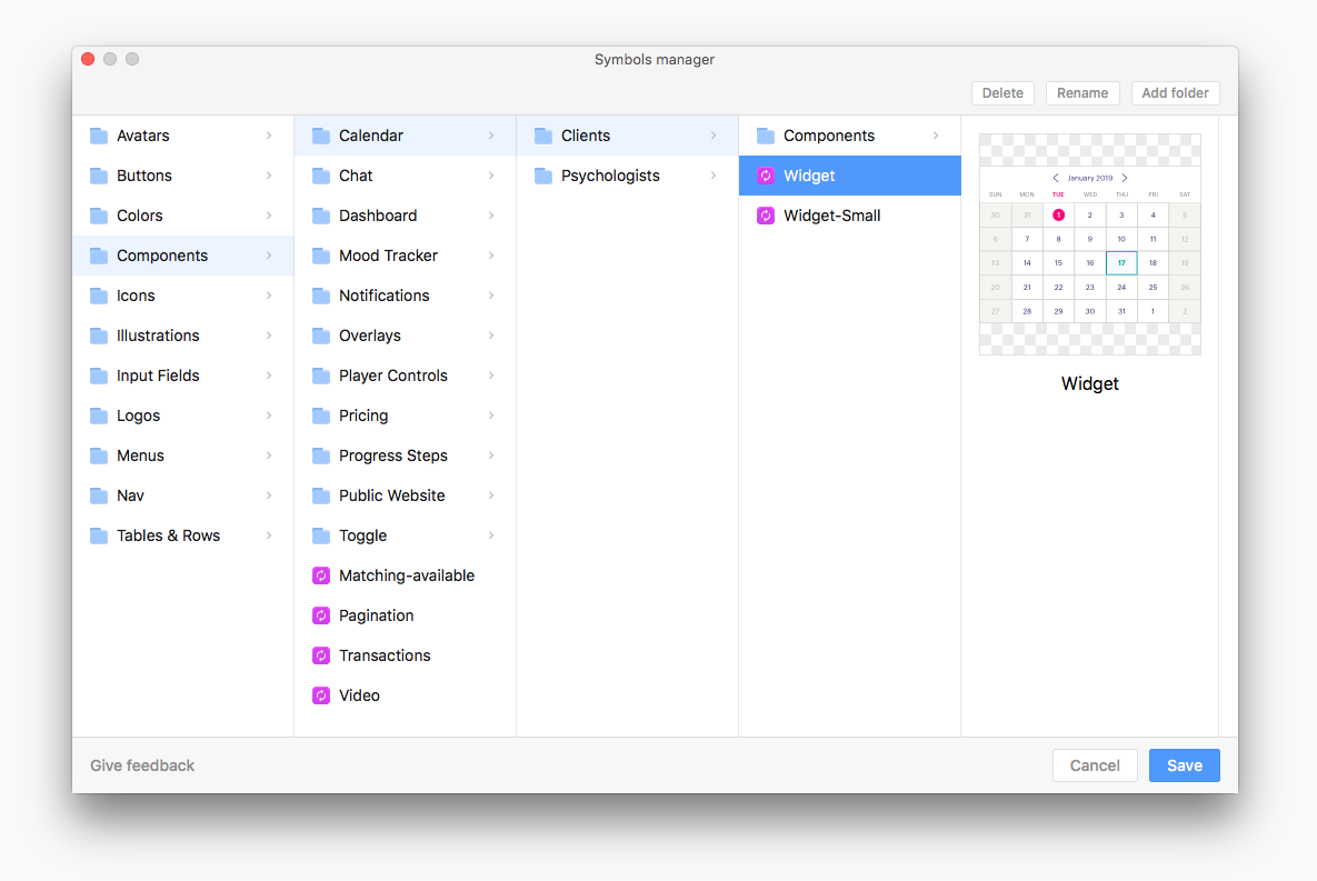
Maintaining a Library
Maintaining an organized symbols library is always a challenge and requires a lot of effort. With Lysn we struggled due to the number of icons and components that were constantly changing. To ease this process, I used "Runner Pro" plugin to help me find and insert symbols more efficiently and "Symbols Manager" to move and organize the symbols architecture. We tried to use "Abstract" to help us with version control. However, because there was only 2 designers working in the UI, it felt like it was slowing us down, due to the added steps to the workflow. We opted to manage our tasks so we don't cross over each other's work. With good communication, we were able to work in different facets of the design more efficiently.
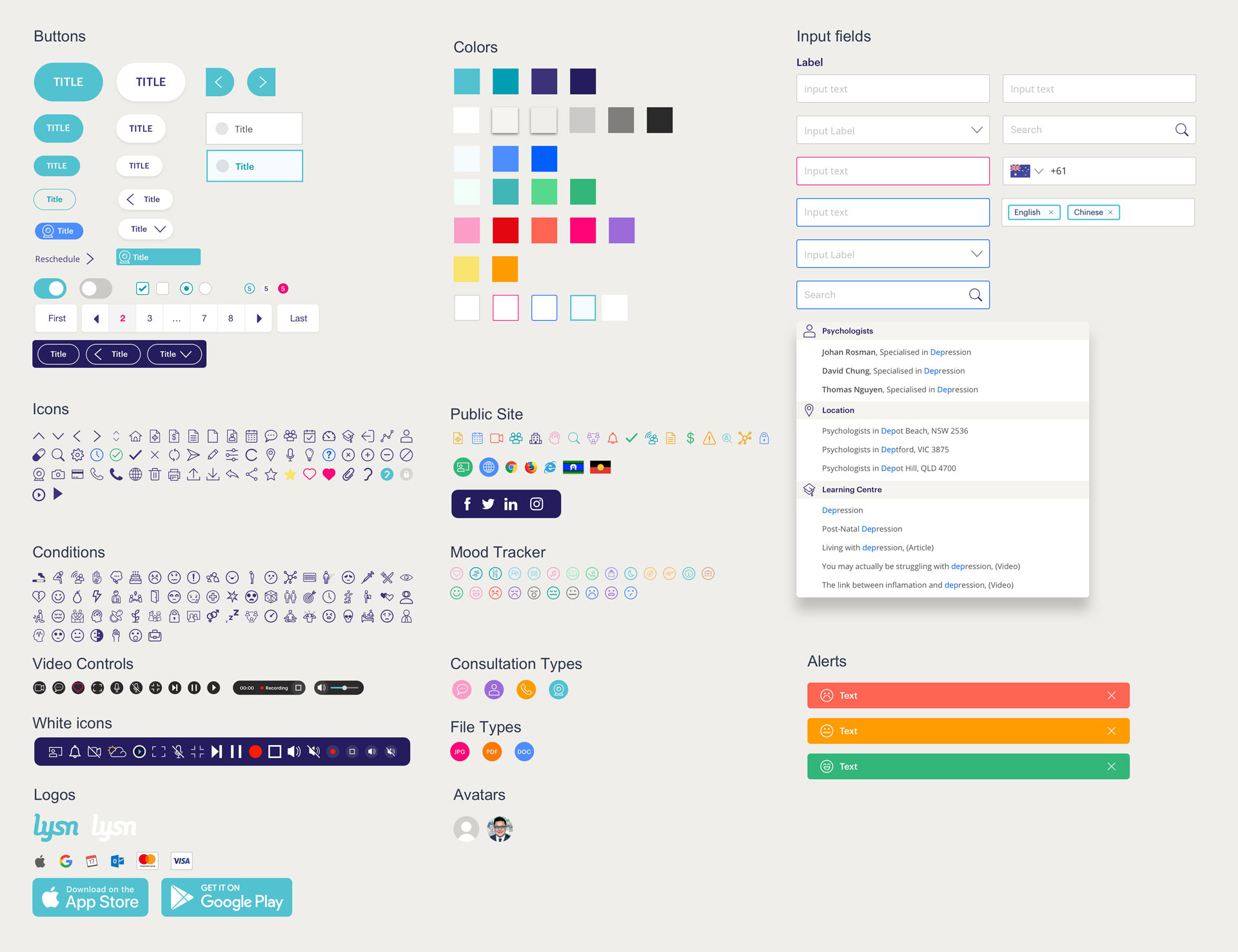
UI-Kit
Screens Design
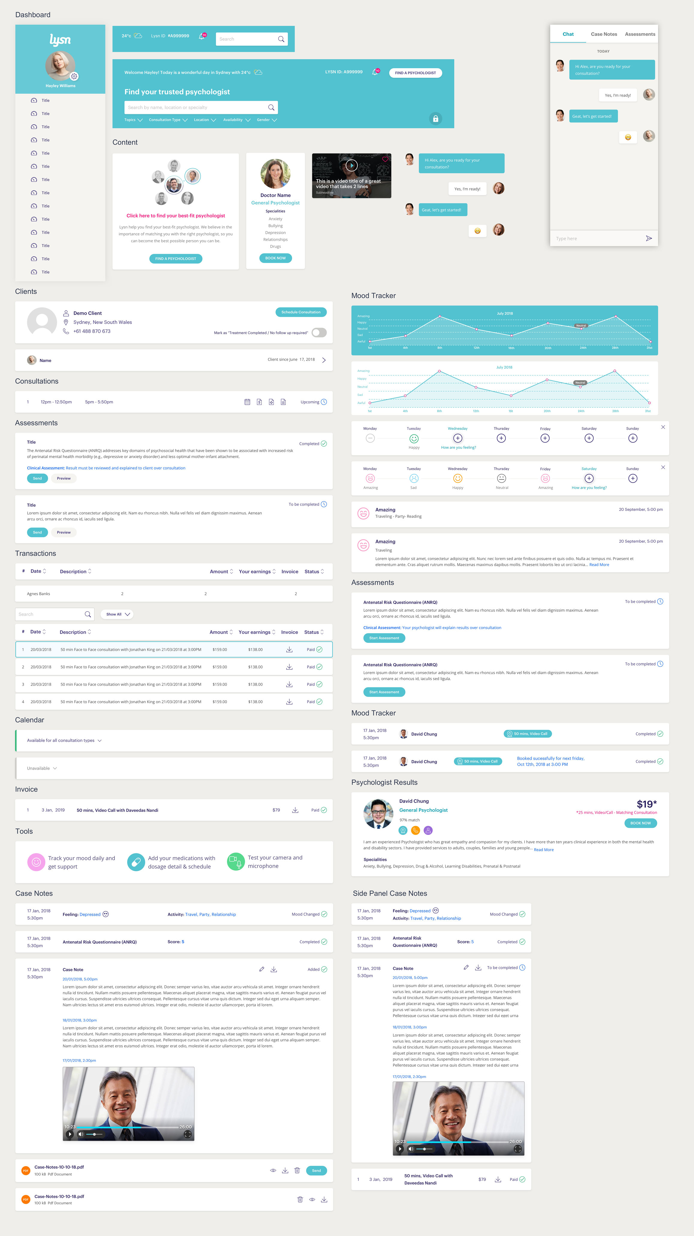
Desktop


Mobile
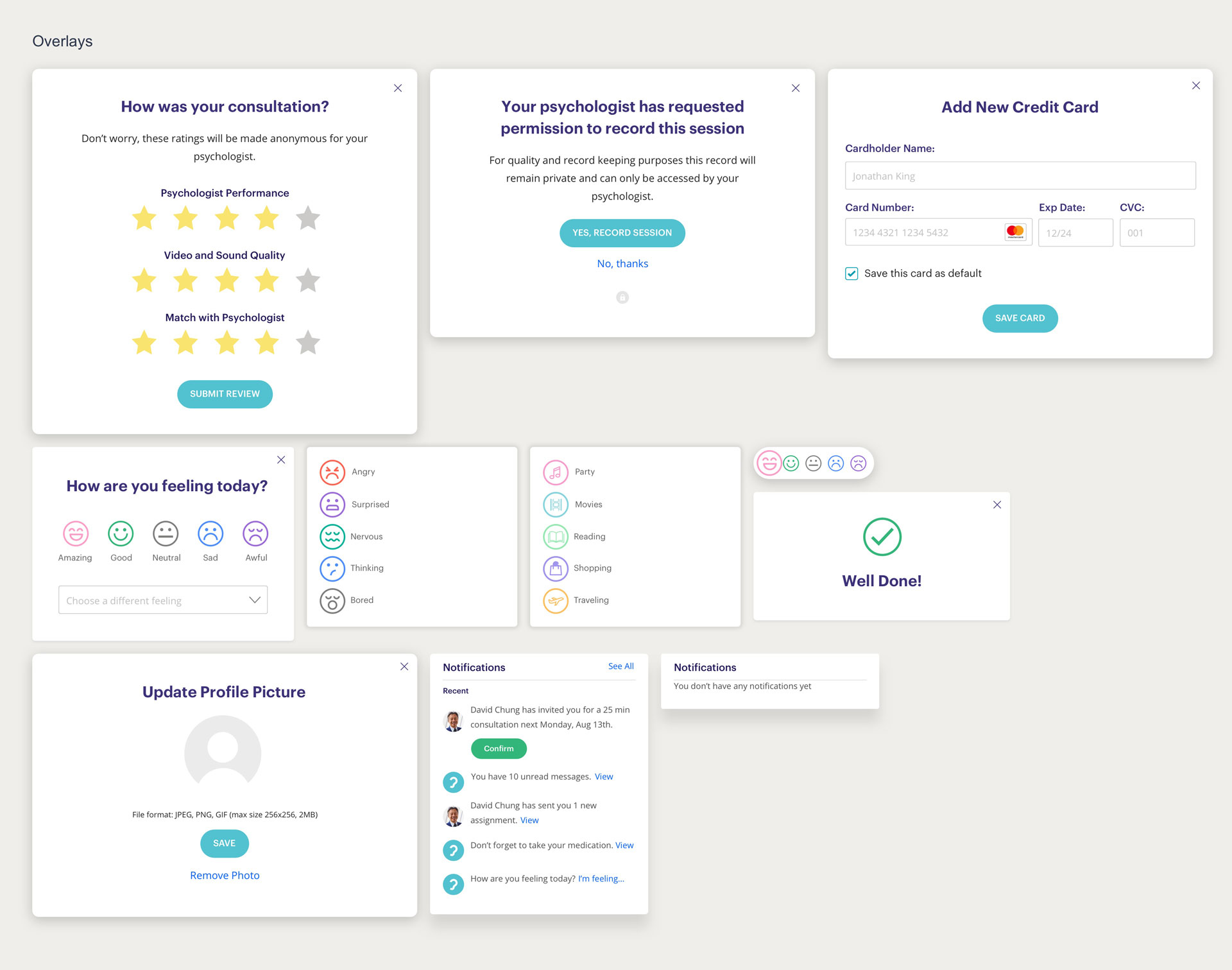
Prototyping
At the beginning of the process, we started to create Invision prototypes in a conventional way. Uploading individual screens and creating hotspots to link them. However, this was really hard to keep up to date. For this reason, I started using "Craft" and our world was so much easier because this allowed us to quickly make changes in the designs and easily update the Invision prototype. Is not perfect and it has its limitations but it works very well for demonstrating user flows and testing.
Testing
We used guerilla testing with the prototypes developed to find usability issues in the new features designed. The whole team was involved in doing testing.